SlideSwift
By Category
💼Business 📊Infographics □Minimal 🕐Timelines ✨Neumorphic 🗑Diagrams 🔄Flow Charts ✨Glassmorphism 🎨Creative 🌍Abstract 🔄Cycle Diagrams 💎Isometric 🖼Illustrations 📱Social Media 🗺MapsBy Slide Type
🚀Pitch Deck 📌Roadmap 🔍SWOT Analysis 📅Timeline 📈Gantt Chart 🏢Org Chart 📋Funnel ⚖Comparison 📄Case Study 📋Agenda ⭐Icons & Lists 👏Thank You
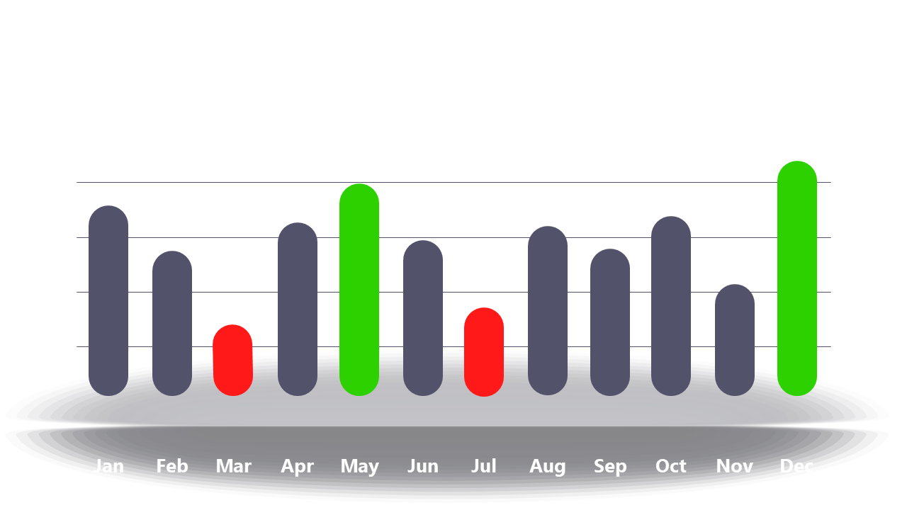
As a business analyst, you often face the challenge of translating complex data into clear visuals for your team. This slide presents a bar chart that showcases monthly performance data, with specific months highlighted in green and red to indicate positive and negative trends. The simplicity and clarity of this chart make it easy for anyone to grasp the key insights at a glance. A reporting manager can use this slide to summarize team performance in a quarterly review, ensuring that stakeholders understand which months achieved targets and which fell short. For a data analyst, it serves as an excellent tool to present findings in a meeting, allowing for straightforward discussions on metrics that matter. You can easily customize the colors or data to fit your specific needs. Whether you’re analyzing trends or presenting them, this slide fits seamlessly into your workflow. $0.99 — add this single slide to any deck from the SlideSwift Slide Library. No subscription needed. Mix slides from any category to build your perfect deck.
Add more from this category to your custom deck