SlideSwift
By Category
💼Business 📊Infographics □Minimal 🕐Timelines ✨Neumorphic 🗑Diagrams 🔄Flow Charts ✨Glassmorphism 🎨Creative 🌍Abstract 🔄Cycle Diagrams 💎Isometric 🖼Illustrations 📱Social Media 🗺MapsBy Slide Type
🚀Pitch Deck 📌Roadmap 🔍SWOT Analysis 📅Timeline 📈Gantt Chart 🏢Org Chart 📋Funnel ⚖Comparison 📄Case Study 📋Agenda ⭐Icons & Lists 👏Thank You
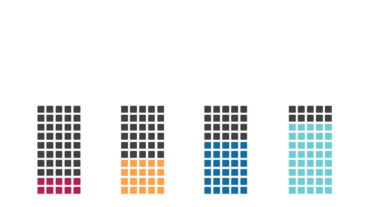
When you’re faced with the need to compare various data sets, an effective visual representation can make all the difference. This stacked bar chart allows you to display multiple categories side by side, making complex information easier to digest at a glance. The chart is designed with vibrant colors and clear labels, ensuring that your audience can quickly grasp the key insights. A data analyst can use this slide to showcase sales performance across different regions, highlighting which areas excel and where improvements are needed. Meanwhile, a finance lead can leverage this chart to present budget allocations across departments, clearly communicating financial priorities to stakeholders. Additionally, a business analyst might find this slide useful for displaying survey results, helping to visualize trends and patterns that inform decision-making. Customizing this slide is straightforward; you can adjust colors and labels to suit your branding or specific data sets. $0.99 — add this single slide to any deck from the SlideSwift Slide Library. No subscription needed. Mix slides from any category to build your perfect deck.
Add more from this category to your custom deck