SlideSwift
By Category
💼Business 📊Infographics □Minimal 🕐Timelines ✨Neumorphic 🗑Diagrams 🔄Flow Charts ✨Glassmorphism 🎨Creative 🌍Abstract 🔄Cycle Diagrams 💎Isometric 🖼Illustrations 📱Social Media 🗺MapsBy Slide Type
🚀Pitch Deck 📌Roadmap 🔍SWOT Analysis 📅Timeline 📈Gantt Chart 🏢Org Chart 📋Funnel ⚖Comparison 📄Case Study 📋Agenda ⭐Icons & Lists 👏Thank You
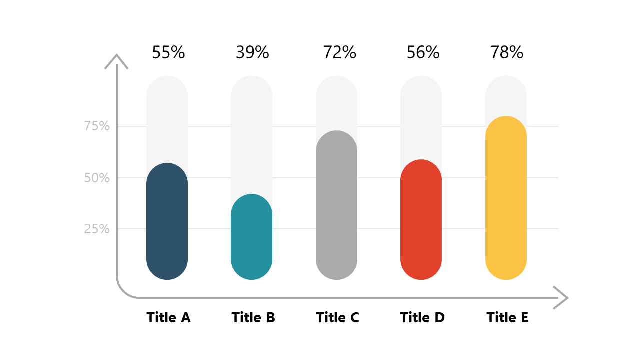
When you need to convey percentage data effectively, a clear visual can make all the difference. Imagine dropping this vertical bar chart slide into your PowerPoint presentation tomorrow morning, effortlessly highlighting the percentage values of five categories. This slide makes it easy to compare data at a glance, ensuring your audience understands the key insights you’re presenting. Reporting managers will find this slide invaluable for summarizing performance metrics, allowing them to communicate results with clarity. Data analysts can use it to illustrate findings from surveys or research, showcasing trends through visually appealing bars. Meanwhile, finance leads can present budget allocations or revenue streams, making financial data more digestible for stakeholders. Customization is straightforward; you can easily adjust the colors and labels to fit your brand or data set. $0.99 — add this single slide to any deck from the SlideSwift Slide Library. No subscription needed. Mix slides from any category to build your perfect deck.
Add more from this category to your custom deck