SlideSwift
By Category
💼Business 📊Infographics □Minimal 🕐Timelines ✨Neumorphic 🗑Diagrams 🔄Flow Charts ✨Glassmorphism 🎨Creative 🌍Abstract 🔄Cycle Diagrams 💎Isometric 🖼Illustrations 📱Social Media 🗺MapsBy Slide Type
🚀Pitch Deck 📌Roadmap 🔍SWOT Analysis 📅Timeline 📈Gantt Chart 🏢Org Chart 📋Funnel ⚖Comparison 📄Case Study 📋Agenda ⭐Icons & Lists 👏Thank You
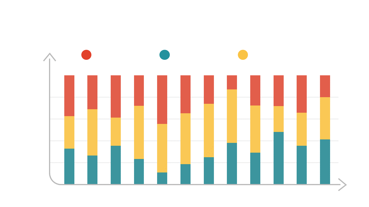
As a finance lead, you often need to present complex data in a way that’s easy to understand. The stacked bar chart slide provides a clear visual representation of multiple data series over time, allowing you to spot trends and compare values effortlessly. With its vibrant colors and organized layout, this slide makes it simple to draw attention to key insights. For a business analyst, using this slide can enhance your reports by clearly illustrating how different variables contribute to overall performance. It allows you to tell a compelling story with your data, making your findings more persuasive. Similarly, a reporting manager can leverage this slide to present quarterly results, showcasing how various categories stack up against each other over time. The slide is easily customizable, allowing you to adjust colors and data labels to fit your specific needs. $0.99 — add this single slide to any deck from the SlideSwift Slide Library. No subscription needed. Mix slides from any category to build your perfect deck.
Add more from this category to your custom deck