SlideSwift
By Category
💼Business 📊Infographics □Minimal 🕐Timelines ✨Neumorphic 🗑Diagrams 🔄Flow Charts ✨Glassmorphism 🎨Creative 🌍Abstract 🔄Cycle Diagrams 💎Isometric 🖼Illustrations 📱Social Media 🗺MapsBy Slide Type
🚀Pitch Deck 📌Roadmap 🔍SWOT Analysis 📅Timeline 📈Gantt Chart 🏢Org Chart 📋Funnel ⚖Comparison 📄Case Study 📋Agenda ⭐Icons & Lists 👏Thank You
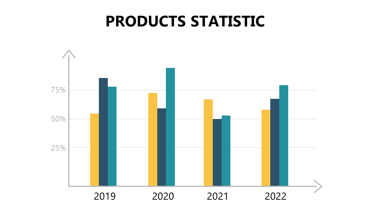
In today’s fast-paced environment, reporting managers often struggle to convey complex performance data in a way that is easily understood. This engaging vertical bar chart, complemented by a clear trend arrow, offers a straightforward method for illustrating statistical data. The slide is designed to highlight changes over time, making it an essential addition to any PowerPoint presentation. Visualize your data with clarity and impact. Reporting managers can use this slide to communicate quarterly performance metrics, ensuring that key stakeholders grasp the information quickly. Data analysts will find it invaluable for presenting data trends, enabling them to make informed decisions based on past performance. Finance leads can utilize this chart to showcase budget allocations versus actual spending, providing a clear overview of financial health. Customizing the colors and data values is a breeze, allowing you to align it with your brand or specific data points. $0.99 — add this single slide to any deck from the SlideSwift Slide Library. No subscription needed. Mix slides from any category to build your perfect deck.
Add more from this category to your custom deck