SlideSwift
By Category
💼Business 📊Infographics □Minimal 🕐Timelines ✨Neumorphic 🗑Diagrams 🔄Flow Charts ✨Glassmorphism 🎨Creative 🌍Abstract 🔄Cycle Diagrams 💎Isometric 🖼Illustrations 📱Social Media 🗺MapsBy Slide Type
🚀Pitch Deck 📌Roadmap 🔍SWOT Analysis 📅Timeline 📈Gantt Chart 🏢Org Chart 📋Funnel ⚖Comparison 📄Case Study 📋Agenda ⭐Icons & Lists 👏Thank You
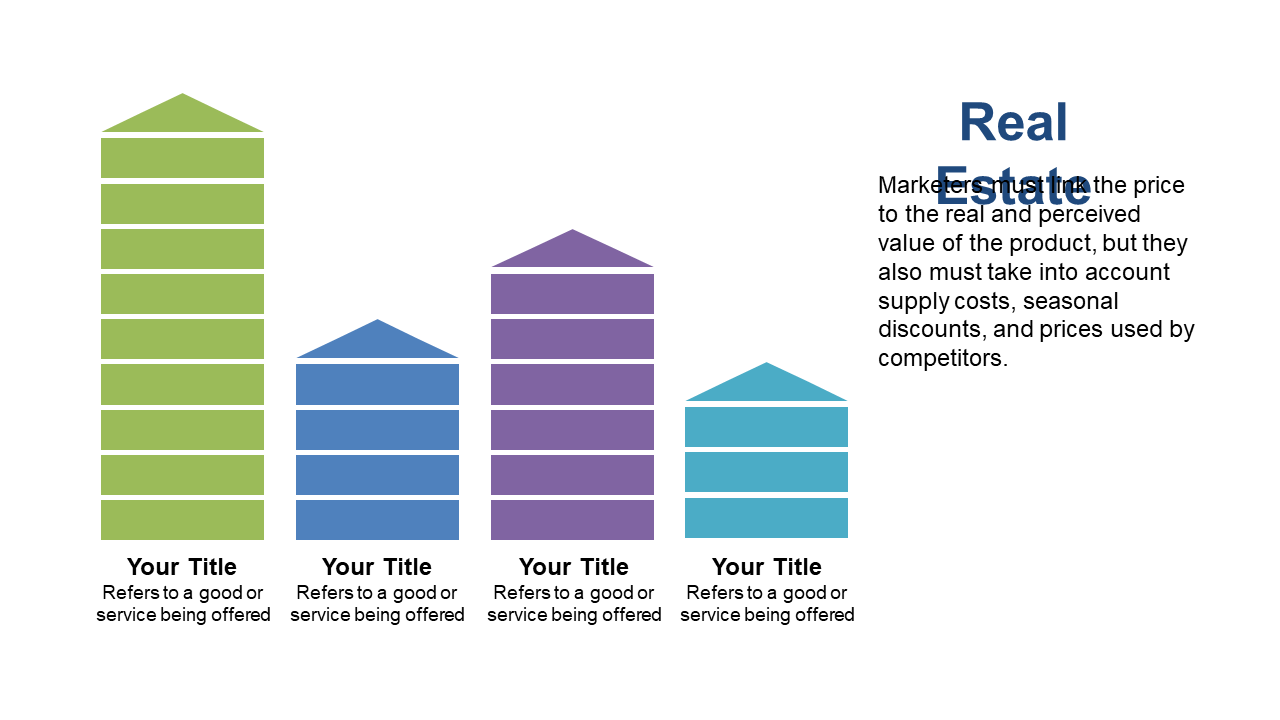
As a data analyst, you often face the challenge of presenting complex datasets in a way that’s easily digestible. This vertical stacked bar chart provides a clear visual representation that allows you to compare multiple datasets side by side without overwhelming your audience. The slide is designed with labeled categories, ensuring that each data point is distinct and easily understood. A finance lead can utilize this chart to showcase budget allocations across various departments, facilitating informed decision-making in a meeting. Meanwhile, a business analyst could employ this slide to visualize sales performance over multiple quarters, providing stakeholders with a comprehensive view of trends and shifts in the market. Customization is straightforward, allowing you to edit labels and colors to match your presentation’s theme. This single slide is ready to enhance your next PowerPoint presentation with impactful visuals. $0.99 — add this single slide to any deck from the SlideSwift Slide Library. No subscription needed. Mix slides from any category to build your perfect deck.
Add more from this category to your custom deck