SlideSwift
By Category
💼Business 📊Infographics □Minimal 🕐Timelines ✨Neumorphic 🗑Diagrams 🔄Flow Charts ✨Glassmorphism 🎨Creative 🌍Abstract 🔄Cycle Diagrams 💎Isometric 🖼Illustrations 📱Social Media 🗺MapsBy Slide Type
🚀Pitch Deck 📌Roadmap 🔍SWOT Analysis 📅Timeline 📈Gantt Chart 🏢Org Chart 📋Funnel ⚖Comparison 📄Case Study 📋Agenda ⭐Icons & Lists 👏Thank You
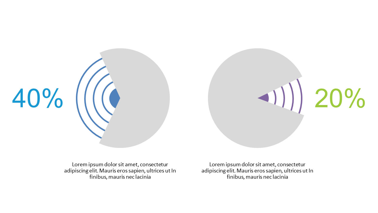
In today’s fast-paced environment, effectively conveying metrics can be challenging. This slide presents a dual percentage circle layout, offering a clear, visual method for comparing two sets of data. With its engaging design, you can easily highlight differences in performance or survey results. Each circle can be customized with your specific percentages and colors, making it adaptable to any presentation style.
As a reporting manager, you can drop this slide into your next presentation to provide a straightforward comparison of quarterly sales targets versus actuals. Data analysts will find it equally useful, allowing them to illustrate survey results effectively, showing two contrasting opinions in a visually appealing manner. Meanwhile, finance leads can leverage this slide to compare budget forecasts against actual expenditures, making financial discussions clearer for stakeholders.
Customization is a breeze—alter colors, percentages, and labels to fit your needs. $0.99 — add this single slide to any deck from the SlideSwift Slide Library. No subscription needed. Mix slides from any category to build your perfect deck.
Add more from this category to your custom deck