SlideSwift
By Category
💼Business 📊Infographics □Minimal 🕐Timelines ✨Neumorphic 🗑Diagrams 🔄Flow Charts ✨Glassmorphism 🎨Creative 🌍Abstract 🔄Cycle Diagrams 💎Isometric 🖼Illustrations 📱Social Media 🗺MapsBy Slide Type
🚀Pitch Deck 📌Roadmap 🔍SWOT Analysis 📅Timeline 📈Gantt Chart 🏢Org Chart 📋Funnel ⚖Comparison 📄Case Study 📋Agenda ⭐Icons & Lists 👏Thank You
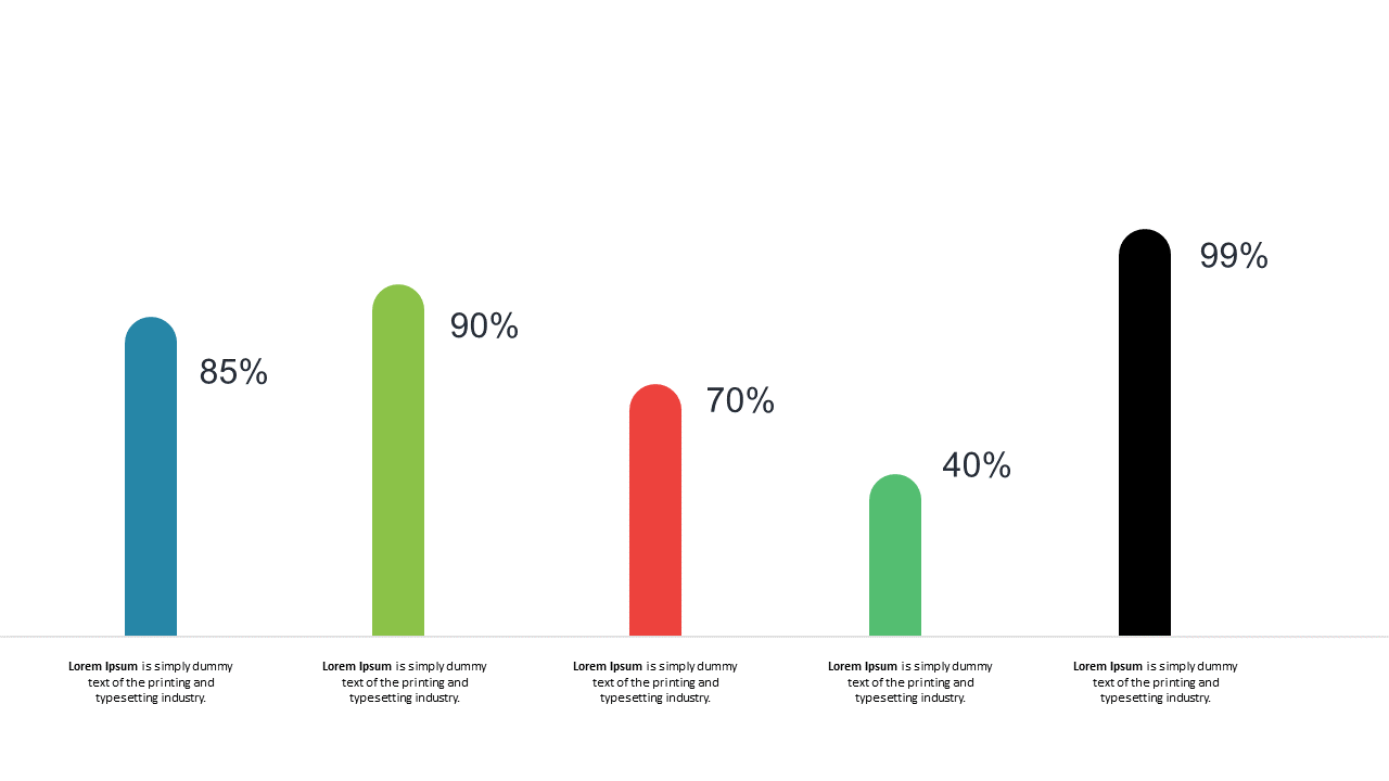
As a business analyst, you often face the challenge of making complex data understandable at a glance. This slide provides a clear, vertical bar chart that makes data comparison straightforward, helping your audience grasp key metrics effortlessly. The visual includes percentage indicators that enhance the clarity of your comparisons, making it a vital addition to your PowerPoint presentations. You will appreciate how easy it is to customize the colors, labels, and data values to fit your specific needs. For a reporting manager, this slide serves as an effective tool to present quarterly performance indicators, allowing for quick assessments of progress against targets. A data analyst can utilize this slide to showcase trends over time, effectively illustrating changes and patterns in data. Its clean design ensures that your data stands out without distraction. Remember, you can easily modify it to align with your branding or aesthetic preferences. $0.99 — add this single slide to any deck from the SlideSwift Slide Library. No subscription needed. Mix slides from any category to build your perfect deck.
Add more from this category to your custom deck