SlideSwift
By Category
💼Business 📊Infographics □Minimal 🕐Timelines ✨Neumorphic 🗑Diagrams 🔄Flow Charts ✨Glassmorphism 🎨Creative 🌍Abstract 🔄Cycle Diagrams 💎Isometric 🖼Illustrations 📱Social Media 🗺MapsBy Slide Type
🚀Pitch Deck 📌Roadmap 🔍SWOT Analysis 📅Timeline 📈Gantt Chart 🏢Org Chart 📋Funnel ⚖Comparison 📄Case Study 📋Agenda ⭐Icons & Lists 👏Thank You
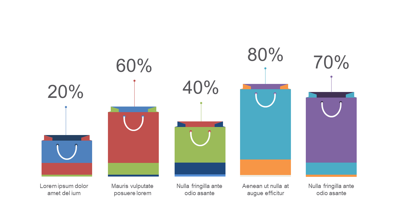
In the finance world, presenting product comparisons can often become tedious, leaving your audience disengaged. This shopping bag chart is an eye-catching visual that transforms straightforward data into an engaging narrative, making it easier for your colleagues to grasp complex comparisons at a glance. Visually, the slide features colorful shopping bags that represent various products, with bars showcasing their percentage values. It’s not just another chart; it’s a conversation starter.
As a finance lead, you can use this slide to compare financial products, highlighting key differences in performance. For a business analyst, this chart can vividly illustrate market trends, making your insights more memorable. A reporting manager will find it invaluable for summarizing product performance during quarterly reviews, ensuring clarity and interest.
Customization is a breeze—you can easily edit colors, labels, and data points to fit your brand’s style. $0.99 — add this single slide to any deck from the SlideSwift Slide Library. No subscription needed. Mix slides from any category to build your perfect deck.
Add more from this category to your custom deck