SlideSwift
By Category
💼Business 📊Infographics □Minimal 🕐Timelines ✨Neumorphic 🗑Diagrams 🔄Flow Charts ✨Glassmorphism 🎨Creative 🌍Abstract 🔄Cycle Diagrams 💎Isometric 🖼Illustrations 📱Social Media 🗺MapsBy Slide Type
🚀Pitch Deck 📌Roadmap 🔍SWOT Analysis 📅Timeline 📈Gantt Chart 🏢Org Chart 📋Funnel ⚖Comparison 📄Case Study 📋Agenda ⭐Icons & Lists 👏Thank You
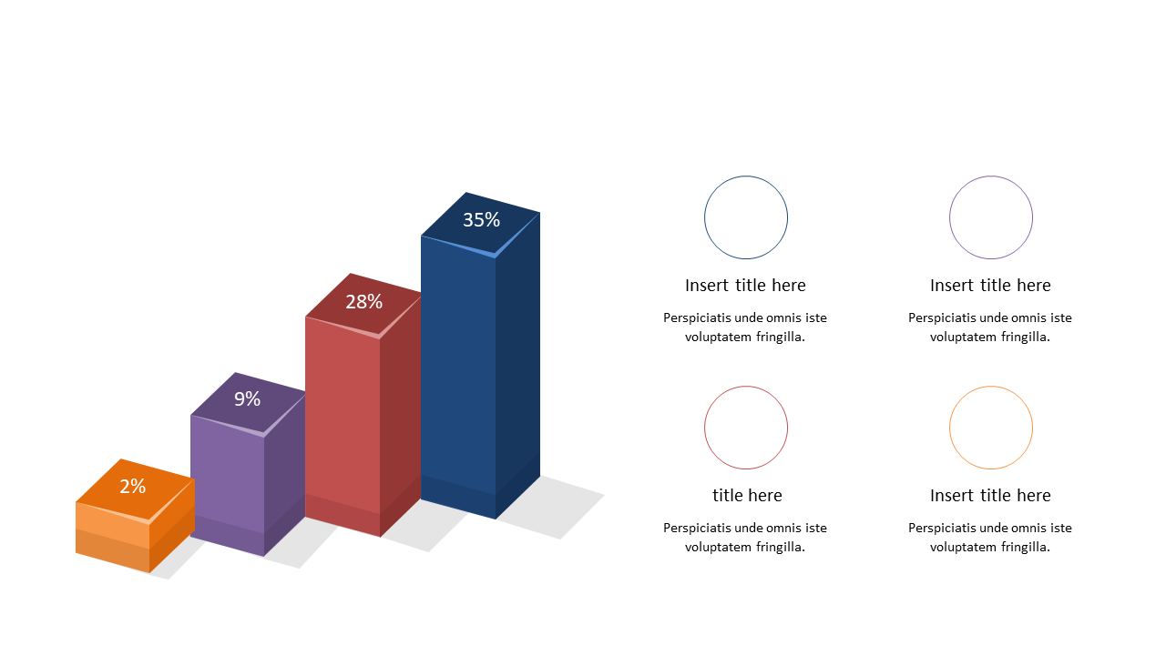
In today’s fast-paced work environment, presenting data in a clear and engaging way is crucial. This 3D bar graph slide not only displays percentage values effectively but also includes editable text boxes that allow you to add context or commentary as needed. With its striking design, this slide makes data comparisons straightforward and visually appealing. For a business analyst, this slide is perfect for illustrating trends in sales or performance metrics. If you’re a reporting manager, you can use it to highlight key findings during meetings or in written reports. Data analysts will find this slide invaluable for summarizing complex data sets, making insights easier for stakeholders to grasp. The slide is customizable, so you can easily adjust the colors and text to match your branding or the specific theme of your presentation. $0.99 — add this single slide to any deck from the SlideSwift Slide Library. No subscription needed. Mix slides from any category to build your perfect deck.
Add more from this category to your custom deck