SlideSwift
By Category
💼Business 📊Infographics □Minimal 🕐Timelines ✨Neumorphic 🗑Diagrams 🔄Flow Charts ✨Glassmorphism 🎨Creative 🌍Abstract 🔄Cycle Diagrams 💎Isometric 🖼Illustrations 📱Social Media 🗺MapsBy Slide Type
🚀Pitch Deck 📌Roadmap 🔍SWOT Analysis 📅Timeline 📈Gantt Chart 🏢Org Chart 📋Funnel ⚖Comparison 📄Case Study 📋Agenda ⭐Icons & Lists 👏Thank You
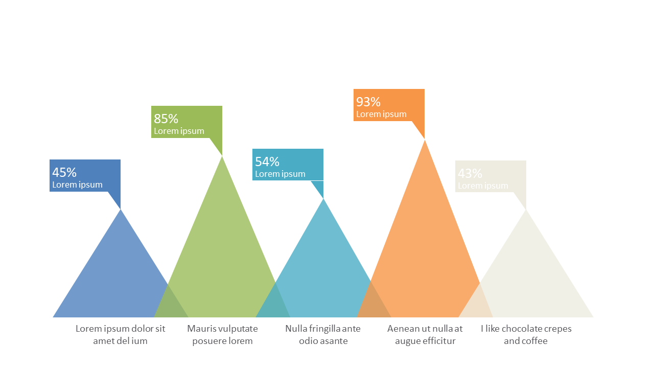
When presenting data, clarity is key. As a data analyst, you often find yourself needing to communicate complex comparisons in an easily digestible format. This pyramid-style chart allows you to display percentages across multiple categories in a visually engaging manner. With its clear segmentation, your audience can quickly grasp the data’s significance. For finance leads, this slide is perfect for illustrating budget allocations or revenue breakdowns, making financial data more accessible to stakeholders. Likewise, business analysts can use this chart to highlight performance metrics, facilitating informed decision-making at a glance. Each section of the pyramid can be customized to fit your color scheme and specific labels, ensuring it aligns with your existing branding. By adding this slide to your presentation toolkit, you’ll make data storytelling more impactful and memorable. $0.99 — add this single slide to any deck from the SlideSwift Slide Library. No subscription needed. Mix slides from any category to build your perfect deck.
Add more from this category to your custom deck