SlideSwift
By Category
💼Business 📊Infographics □Minimal 🕐Timelines ✨Neumorphic 🗑Diagrams 🔄Flow Charts ✨Glassmorphism 🎨Creative 🌍Abstract 🔄Cycle Diagrams 💎Isometric 🖼Illustrations 📱Social Media 🗺MapsBy Slide Type
🚀Pitch Deck 📌Roadmap 🔍SWOT Analysis 📅Timeline 📈Gantt Chart 🏢Org Chart 📋Funnel ⚖Comparison 📄Case Study 📋Agenda ⭐Icons & Lists 👏Thank You
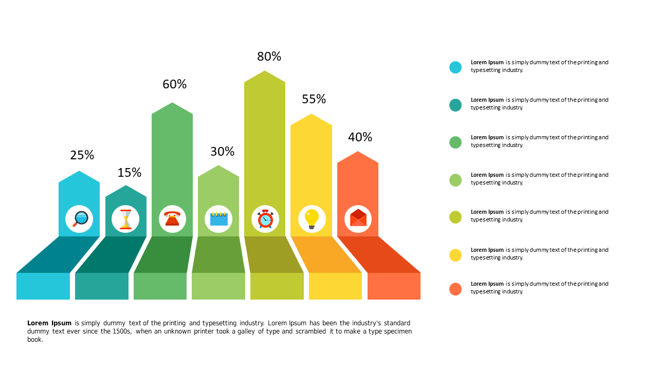
When you need to present data clearly and effectively, comparing values can often become a challenge. This horizontal bar chart makes that comparison straightforward and visually appealing. With labeled data points, you can easily convey trends or performance metrics in a way that your audience will grasp immediately. Imagine incorporating this slide into your next PowerPoint presentation, allowing your audience to quickly understand the differences in values at a glance. A data analyst can utilize this slide to showcase monthly sales figures, while a finance lead may find it essential for illustrating budget allocations. Meanwhile, a business analyst can use it to highlight key performance indicators across different departments. The beauty of this slide is its flexibility; you can customize the colors and values to match your existing theme or branding. $0.99 — add this single slide to any deck from the SlideSwift Slide Library. No subscription needed. Mix slides from any category to build your perfect deck.
Add more from this category to your custom deck