SlideSwift
By Category
💼Business 📊Infographics □Minimal 🕐Timelines ✨Neumorphic 🗑Diagrams 🔄Flow Charts ✨Glassmorphism 🎨Creative 🌍Abstract 🔄Cycle Diagrams 💎Isometric 🖼Illustrations 📱Social Media 🗺MapsBy Slide Type
🚀Pitch Deck 📌Roadmap 🔍SWOT Analysis 📅Timeline 📈Gantt Chart 🏢Org Chart 📋Funnel ⚖Comparison 📄Case Study 📋Agenda ⭐Icons & Lists 👏Thank You
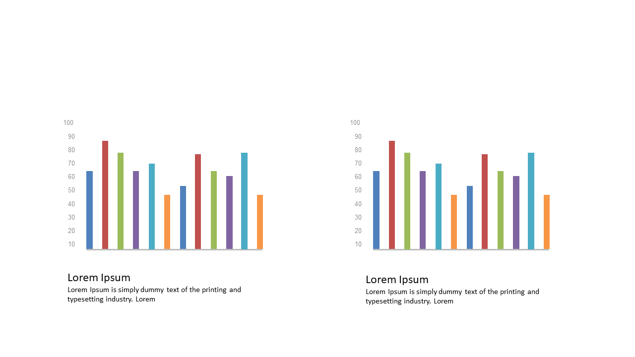
When presenting data, clarity is key, especially in today’s fast-paced work environment. It can be challenging to illustrate differences between data sets effectively. This slide uses dual vertical bar graphs, arranged side by side, for a straightforward comparison, making it easy for your audience to grasp key insights. With customizable colors and labels, you can tailor it to match your branding or highlight specific data points. As a business analyst, you can quickly pull this slide into your report to emphasize trends in sales performance versus last quarter. For a reporting manager, this slide serves as an excellent tool to compare target metrics against actual results, providing a visual snapshot that facilitates discussion. A data analyst can use it to showcase findings from a recent analysis, making complex information digestible. Personalize it to fit your style, and watch as it enhances your narrative. $0.99 — add this single slide to any deck from the SlideSwift Slide Library. No subscription needed. Mix slides from any category to build your perfect deck.
Add more from this category to your custom deck