SlideSwift
By Category
💼Business 📊Infographics □Minimal 🕐Timelines ✨Neumorphic 🗑Diagrams 🔄Flow Charts ✨Glassmorphism 🎨Creative 🌍Abstract 🔄Cycle Diagrams 💎Isometric 🖼Illustrations 📱Social Media 🗺MapsBy Slide Type
🚀Pitch Deck 📌Roadmap 🔍SWOT Analysis 📅Timeline 📈Gantt Chart 🏢Org Chart 📋Funnel ⚖Comparison 📄Case Study 📋Agenda ⭐Icons & Lists 👏Thank You
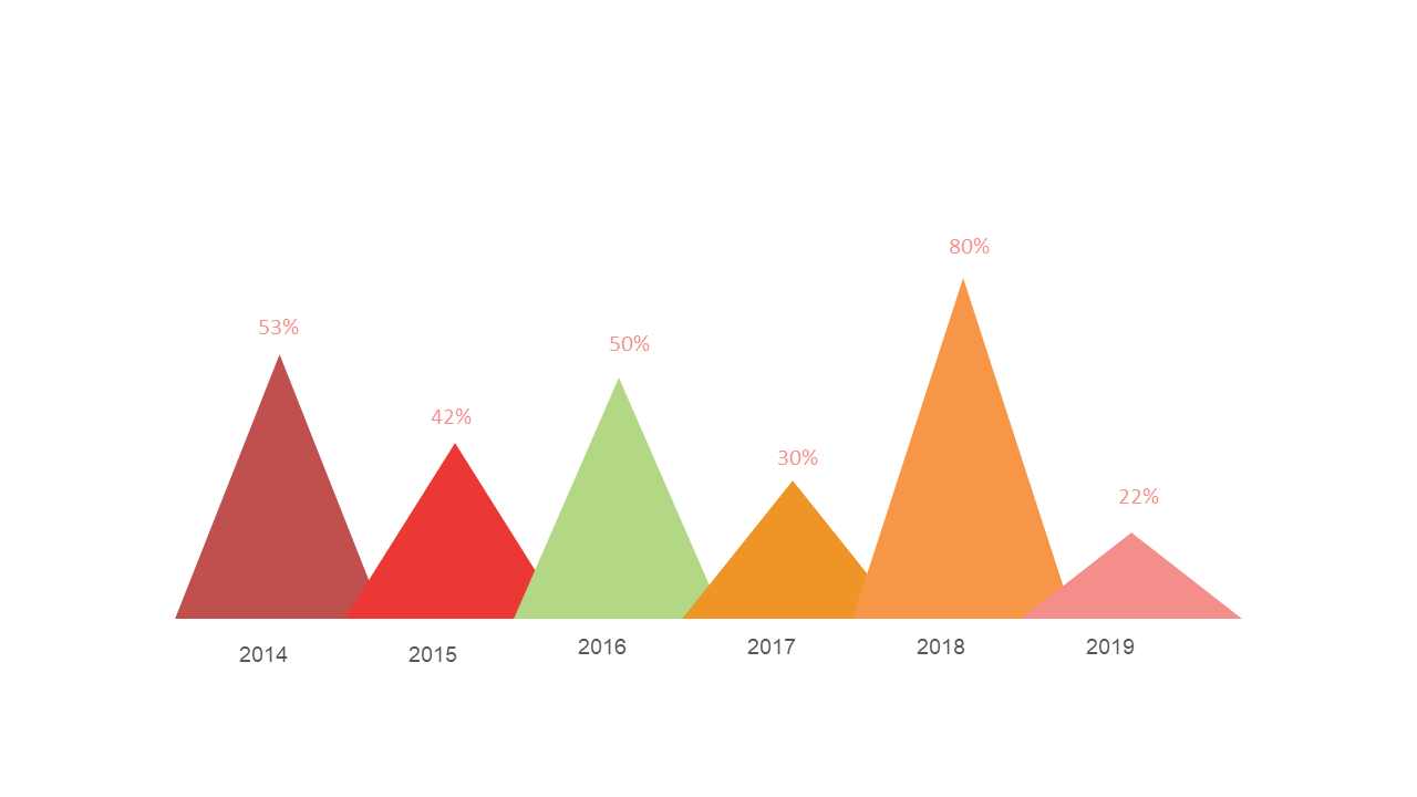
When it comes to presenting yearly trends, clarity is key, yet many reporting managers find it challenging to convey complex data in an understandable way. This slide offers a straightforward triangle chart that showcases essential data points, each clearly labeled by year, allowing your audience to grasp trends at a glance. The design is clean and professional, fitting seamlessly into any PowerPoint presentation. For a reporting manager, this slide can simplify the presentation of annual performance metrics, ensuring stakeholders quickly understand the data. Data analysts can benefit from this visual tool to highlight key findings in reports, making it easier to support their insights with compelling visuals. Moreover, finance leads can use this chart to compare financial performance over multiple years, enhancing their presentations with clear visual narratives. Customization is simple, allowing you to adjust colors and values without hassle. $0.99 — add this single slide to any deck from the SlideSwift Slide Library. No subscription needed. Mix slides from any category to build your perfect deck.
Add more from this category to your custom deck