SlideSwift
By Category
💼Business 📊Infographics □Minimal 🕐Timelines ✨Neumorphic 🗑Diagrams 🔄Flow Charts ✨Glassmorphism 🎨Creative 🌍Abstract 🔄Cycle Diagrams 💎Isometric 🖼Illustrations 📱Social Media 🗺MapsBy Slide Type
🚀Pitch Deck 📌Roadmap 🔍SWOT Analysis 📅Timeline 📈Gantt Chart 🏢Org Chart 📋Funnel ⚖Comparison 📄Case Study 📋Agenda ⭐Icons & Lists 👏Thank You
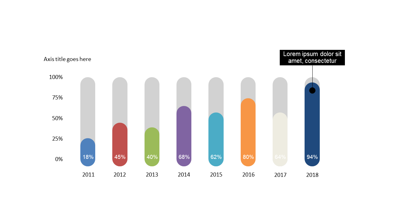
Are you struggling to present data trends in a way that your audience can easily grasp? It can be challenging to convey performance metrics effectively, especially when you’re pressed for time. This vertical bar chart provides a clear and compelling visual representation of data over multiple years, allowing your audience to quickly compare values and spot trends. With its clean design and detailed data labels, you can showcase insights without overwhelming your viewers. Reporting managers can utilize this slide to effectively communicate quarterly performance trends in meetings, while data analysts can use it to highlight year-over-year growth in reports. Finance leads can present budget forecasts against actual expenditures, making financial discussions more accessible. Plus, the chart is fully editable, so you can adjust colors and labels to match your presentation style or corporate branding. $0.99 — add this single slide to any deck from the SlideSwift Slide Library. No subscription needed. Mix slides from any category to build your perfect deck.
Add more from this category to your custom deck