SlideSwift
By Category
💼Business 📊Infographics □Minimal 🕐Timelines ✨Neumorphic 🗑Diagrams 🔄Flow Charts ✨Glassmorphism 🎨Creative 🌍Abstract 🔄Cycle Diagrams 💎Isometric 🖼Illustrations 📱Social Media 🗺MapsBy Slide Type
🚀Pitch Deck 📌Roadmap 🔍SWOT Analysis 📅Timeline 📈Gantt Chart 🏢Org Chart 📋Funnel ⚖Comparison 📄Case Study 📋Agenda ⭐Icons & Lists 👏Thank You
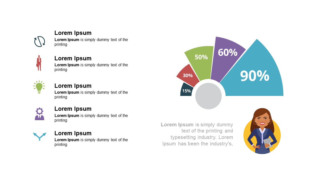
When you’re tasked with conveying complex financial data, the last thing you want is a cluttered slide that confuses your audience. This pie chart layout captures attention with its vibrant colors and clear icon-based labels that represent percentage distributions effectively. Visually, it stands out with an engaging design that makes data interpretation straightforward. As a finance lead, you can use this slide to present budget allocations, revenue breakdowns, or expenditure analyses during quarterly meetings. Business analysts will find it equally useful for showcasing market research findings or survey results, ensuring stakeholders grasp key insights quickly. Reporting managers can leverage this slide to summarize performance metrics in a way that promotes discussion and decision-making. You can easily customize the colors, percentages, and icons to fit your unique data set or branding. $0.99 — add this single slide to any deck from the SlideSwift Slide Library. No subscription needed. Mix slides from any category to build your perfect deck.
Add more from this category to your custom deck