Showing 365 slides
in Data Visualization

View full slide →
✓
Engage audiences with COVID-19 impact data visualization using a UK map and charts.
View full slide →
✓
Visualize COVID-19 statistics in the UK with an editable map and data visualization.
View full slide →
✓
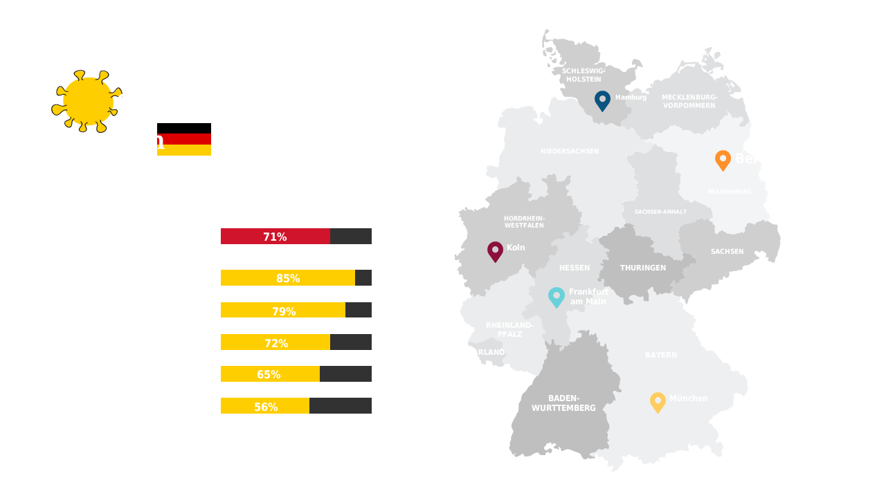
Visualize statistical data for Germany using a map and percentage bar graphs.
View full slide →
✓
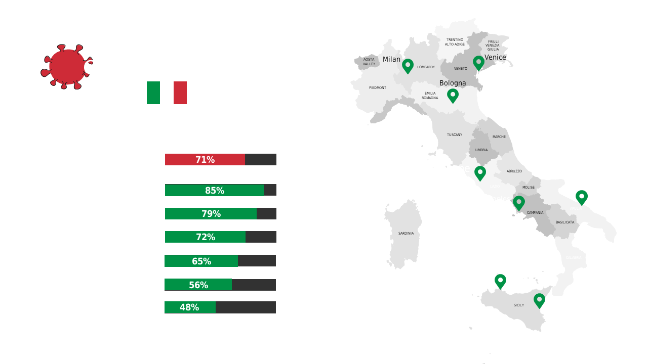
Explore COVID-19 impact data in Italy with geographic visuals and statistics.
View full slide →
✓
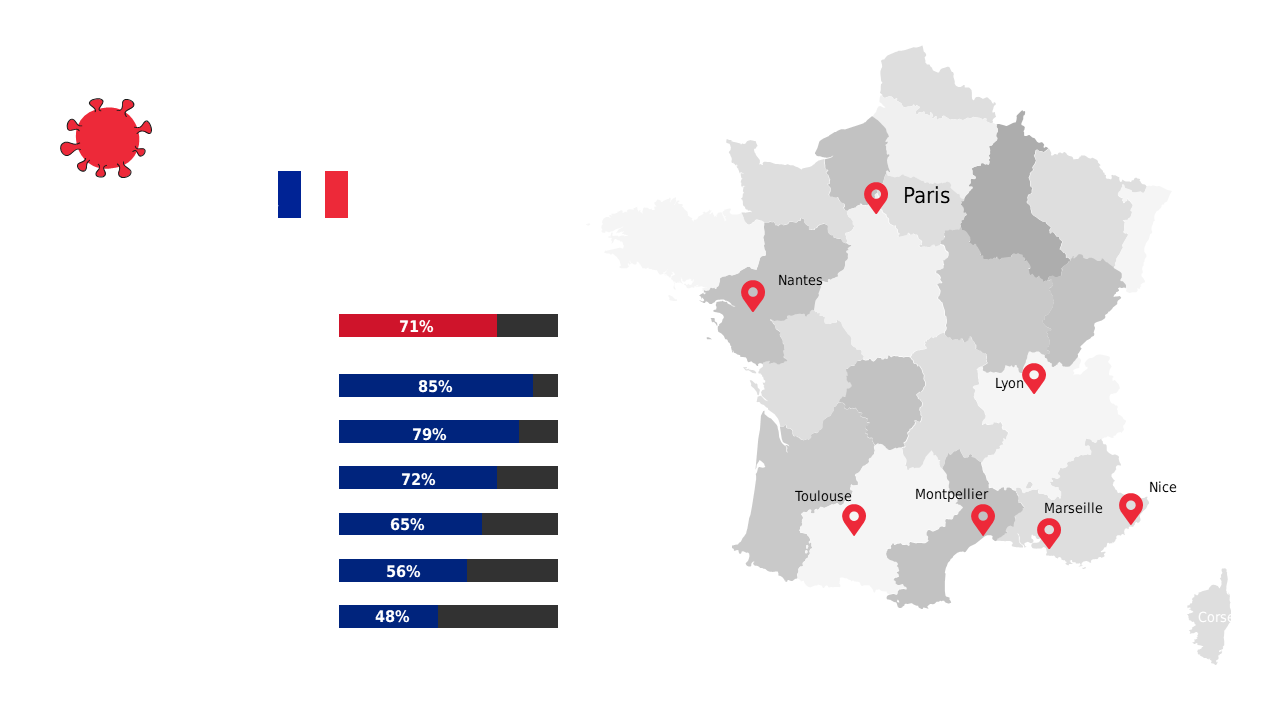
Present COVID-19 data for France using a map and bar graph for clarity.
View full slide →
✓
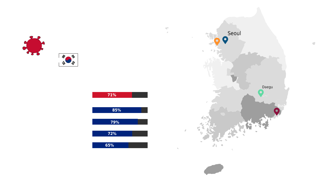
Visualize COVID-19 statistics in South Korea with a map and bar chart for presentations.
View full slide →
✓
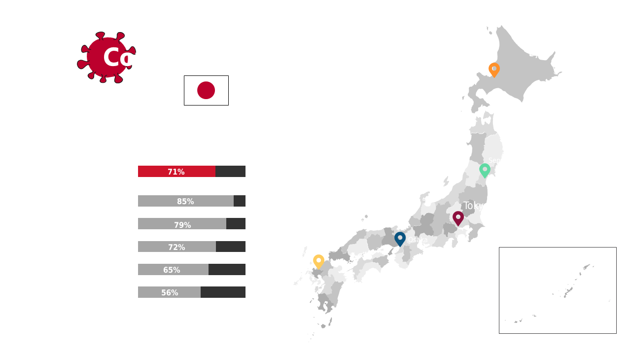
Visualize COVID-19 infection rates in Japan using a map and relevant statistics.
View full slide →
✓
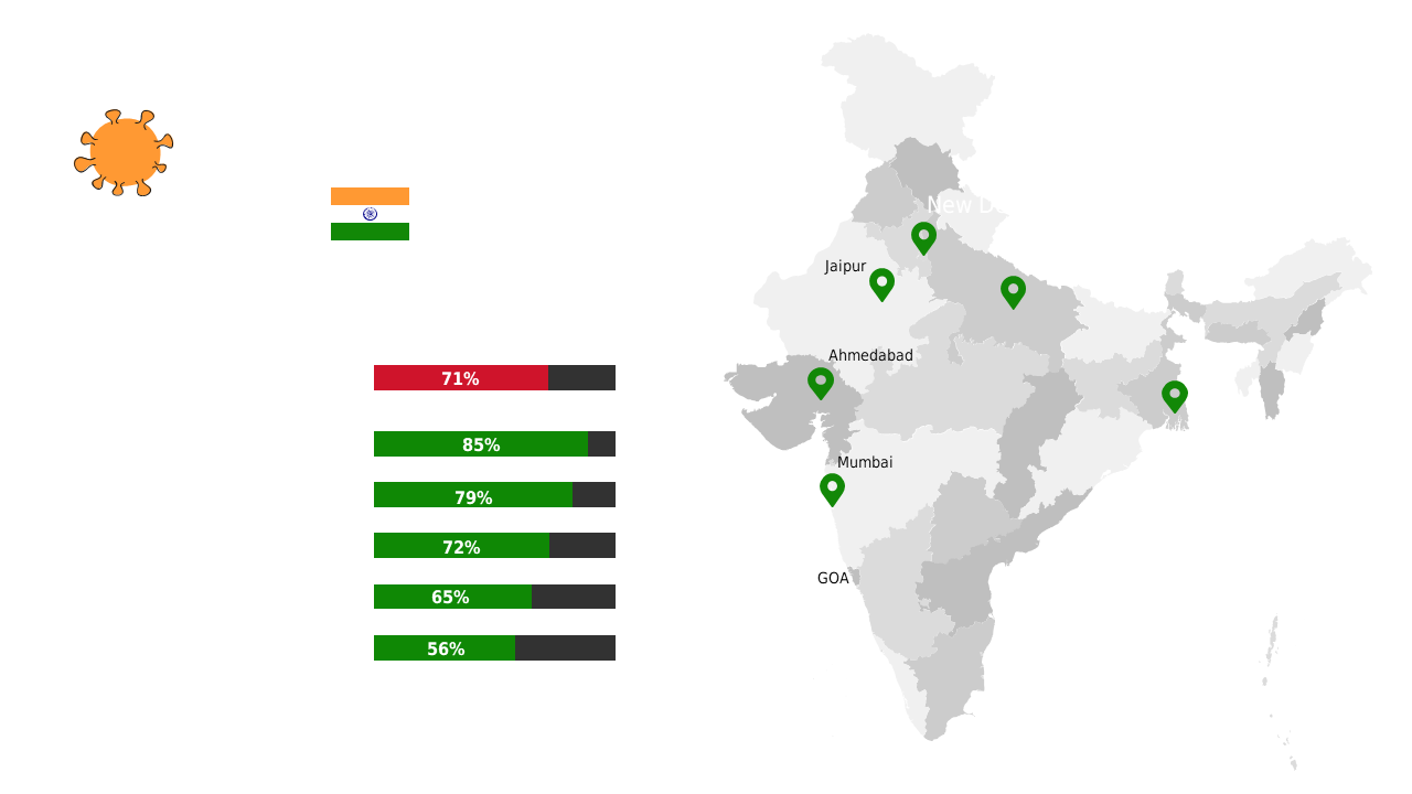
Present COVID-19 data in India with editable metrics and geographic visuals.
View full slide →
✓
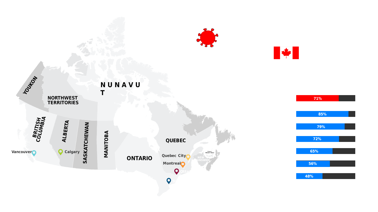
Present provincial COVID-19 vaccination rates in Canada with an editable map for clarity.
View full slide →
✓
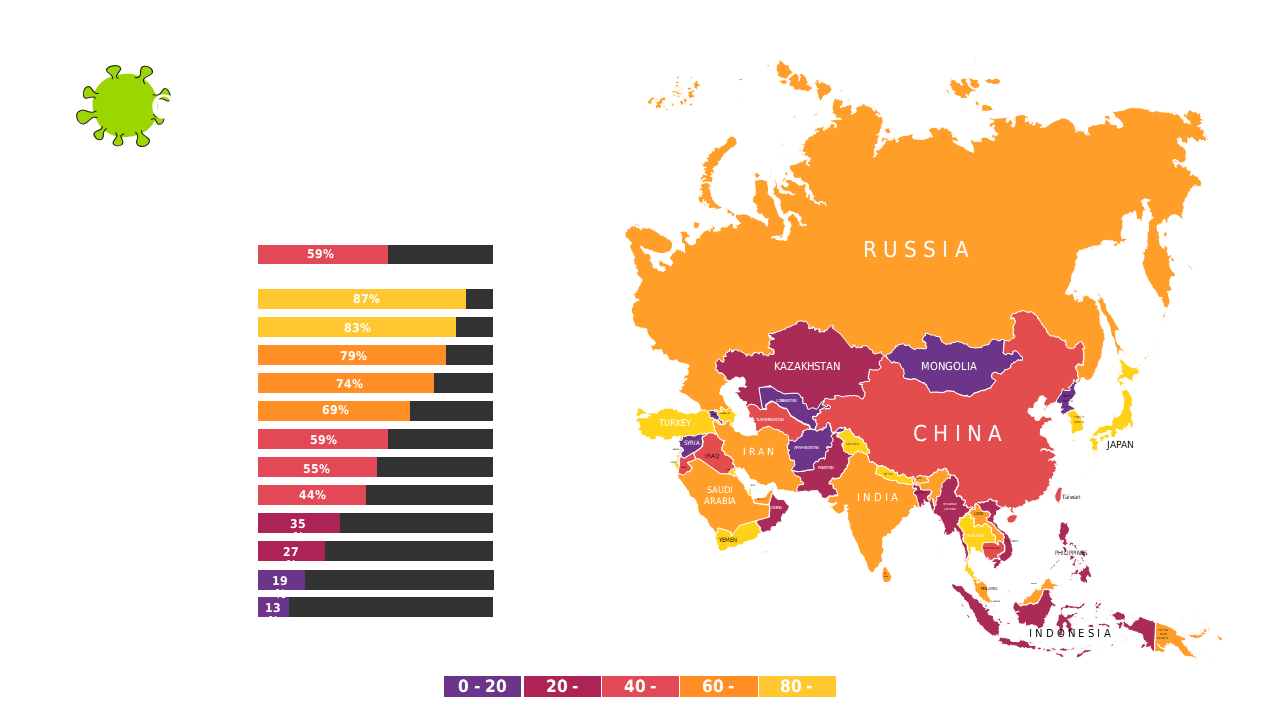
Showcase regional data insights in Asia using a color-coded map and bar chart for presentations.
View full slide →
✓
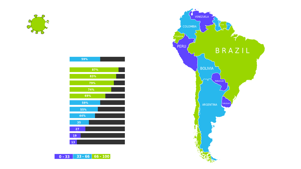
Visualize regional statistics in South America with a color-coded map and percentage bar graph.
View full slide →
✓
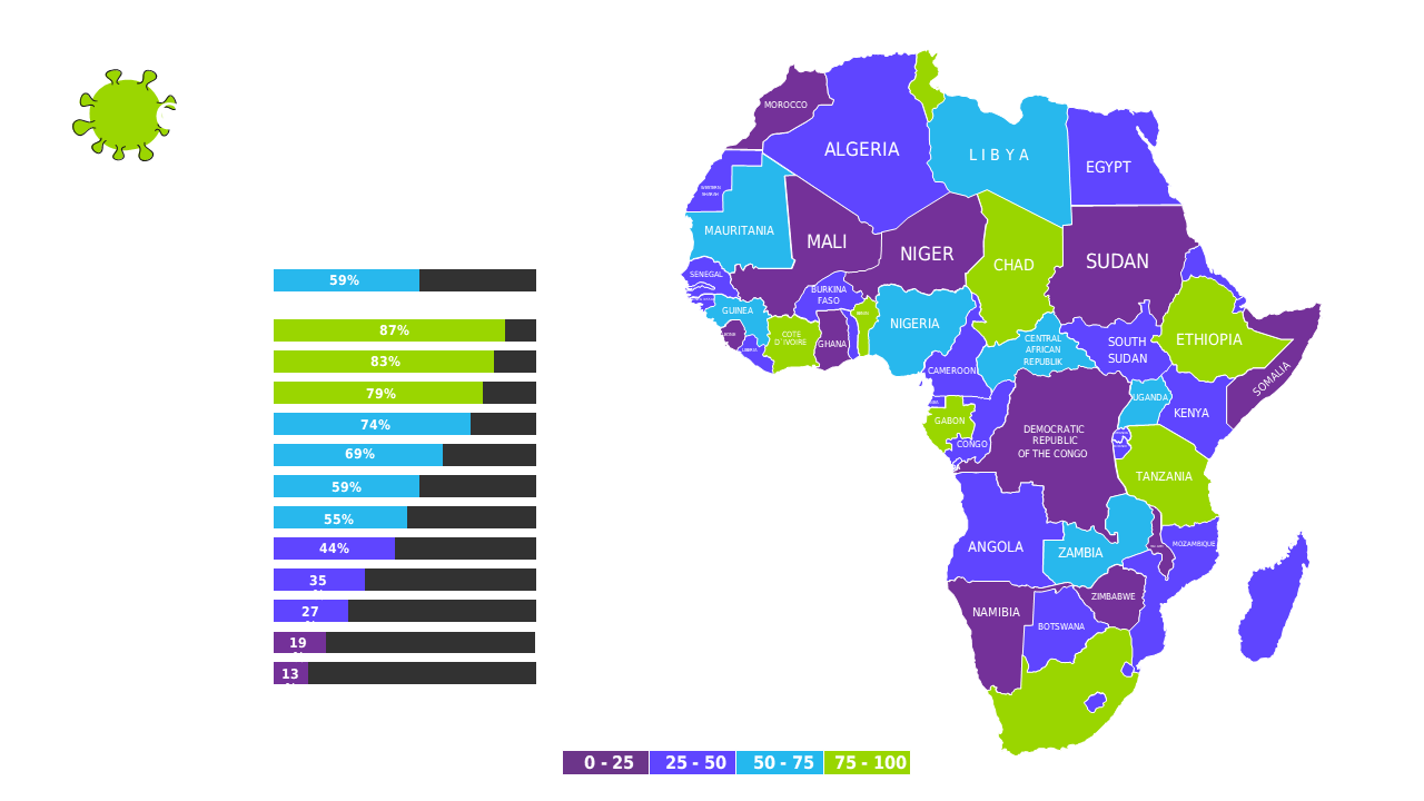
Present regional performance metrics in Africa using a color-coded map and bar chart.
 SlideSwift