Showing 365 slides
in Data Visualization

View full slide →
✓
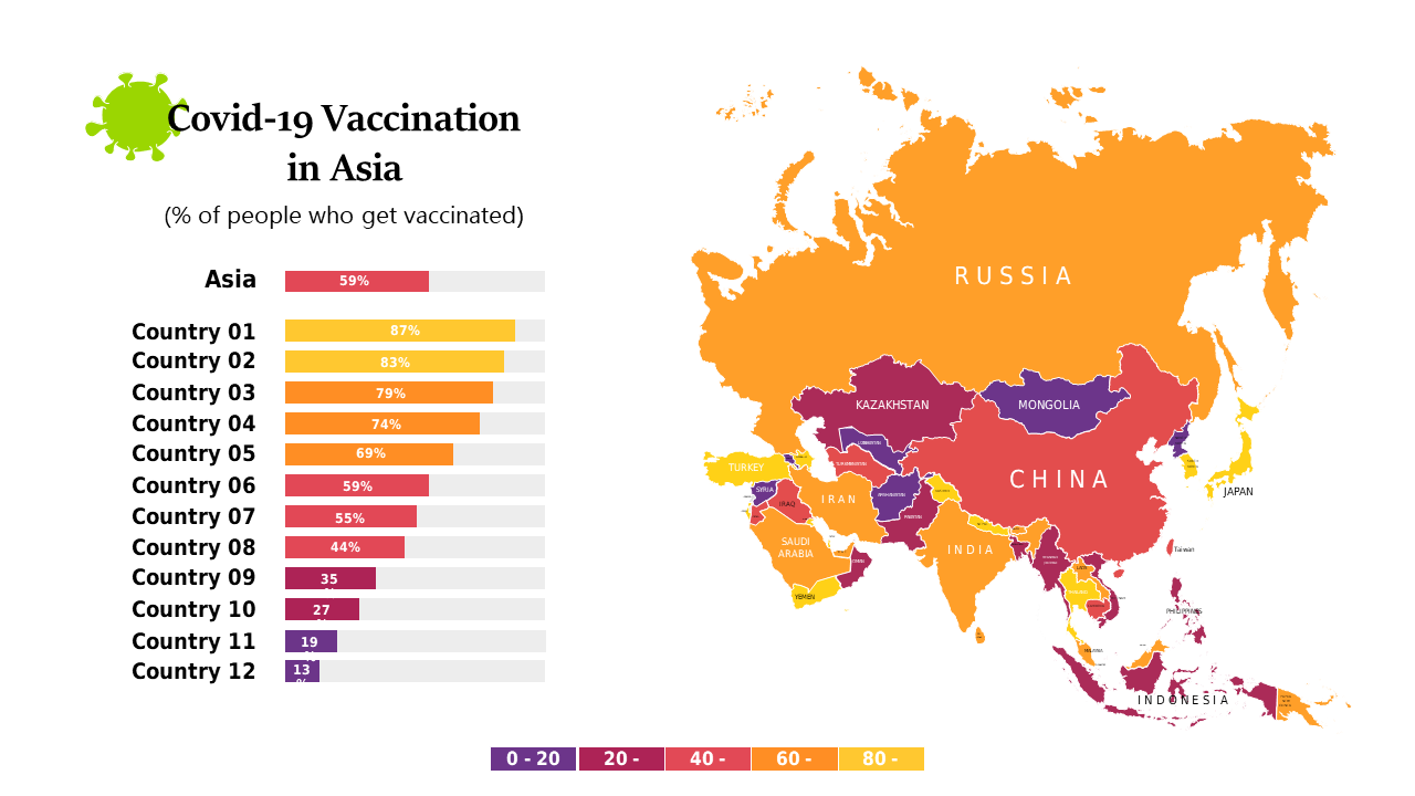
Visualize and compare COVID-19 vaccination rates in Asia with this editable map and data bars.
View full slide →
✓
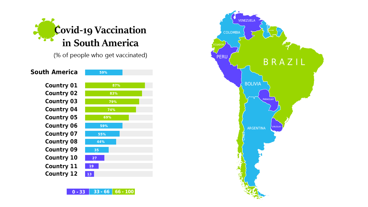
Combine maps and charts to present COVID-19 vaccination rates across South America effectively.
View full slide →
✓
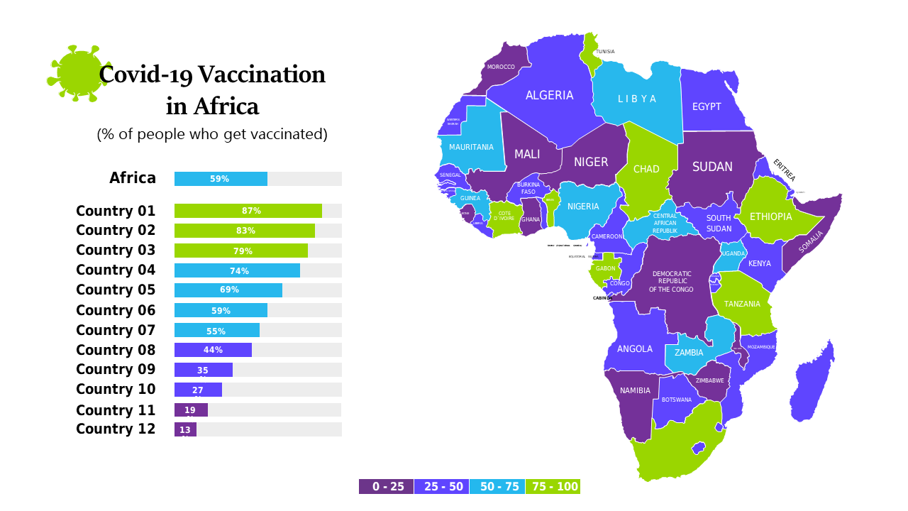
Explore vaccination rates in Africa with a choropleth map and bar chart for impactful presentations.
View full slide →
✓
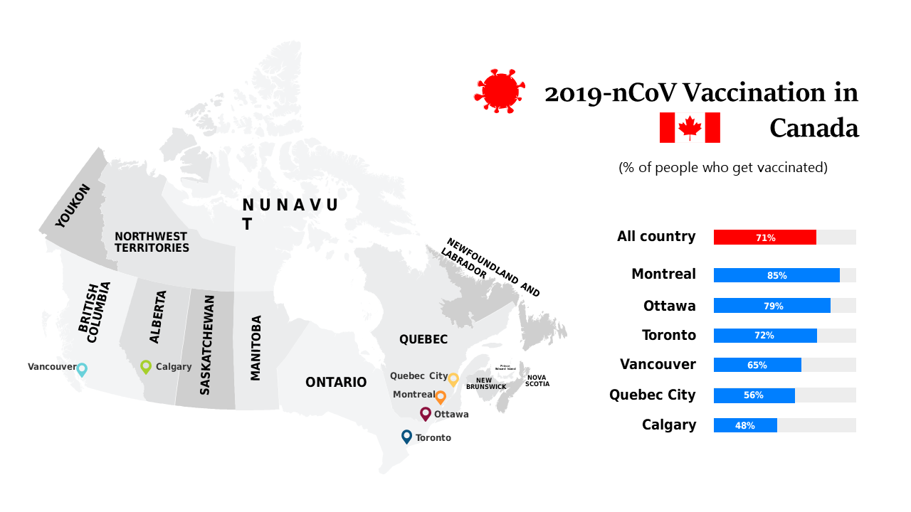
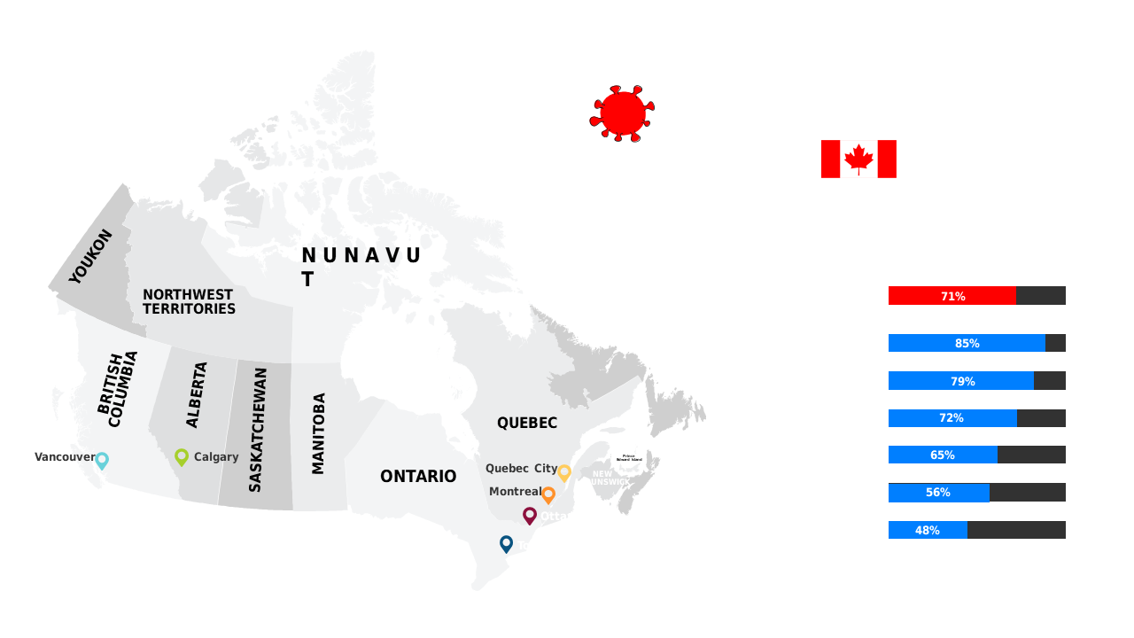
Present COVID-19 vaccination statistics in Canada with this informative map layout.
View full slide →
✓
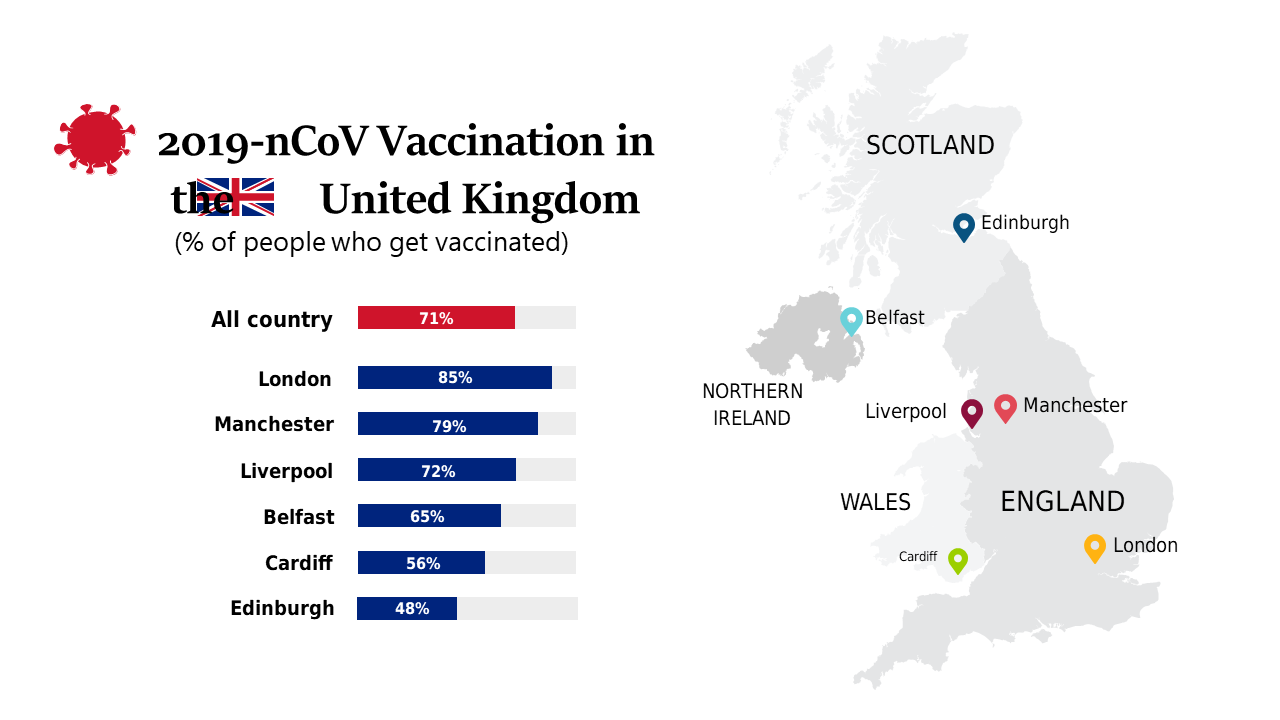
Utilize maps and charts to present COVID-19 vaccination data across UK cities effectively.
View full slide →
✓
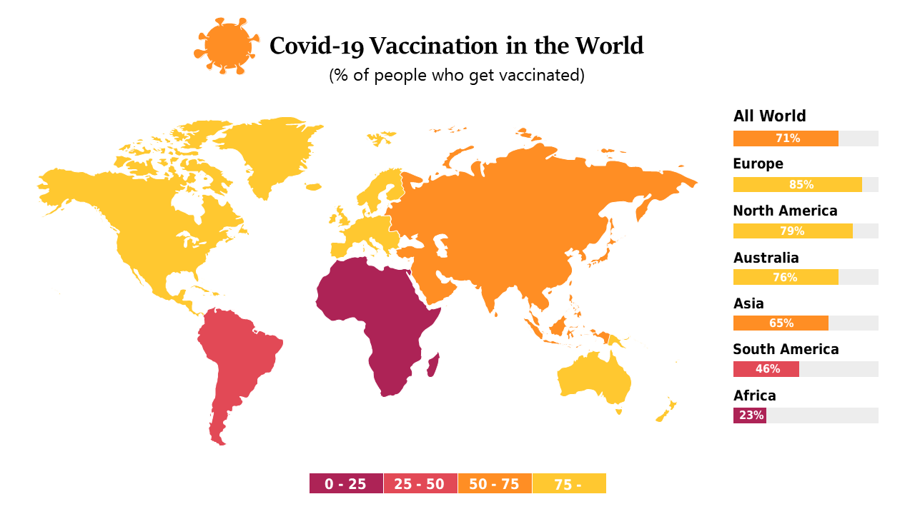
Visualize global COVID-19 vaccination rates with this customizable map for health professionals.
View full slide →
✓
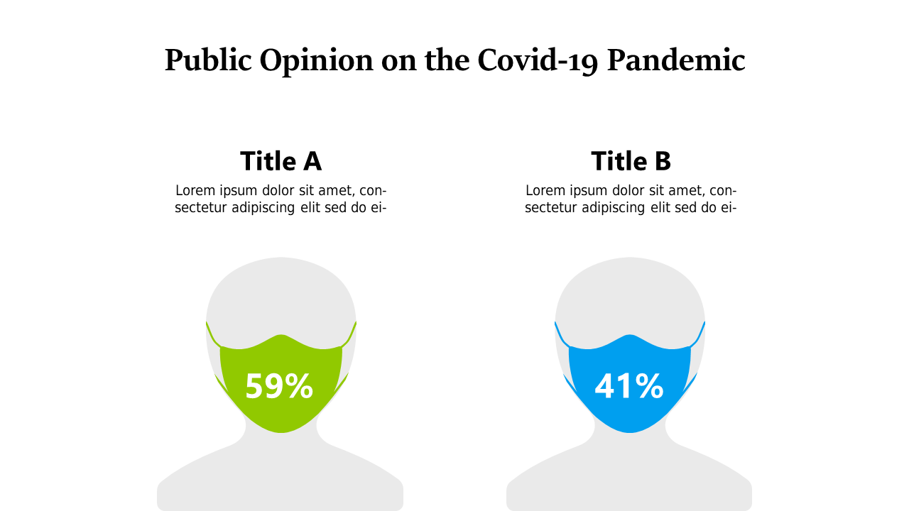
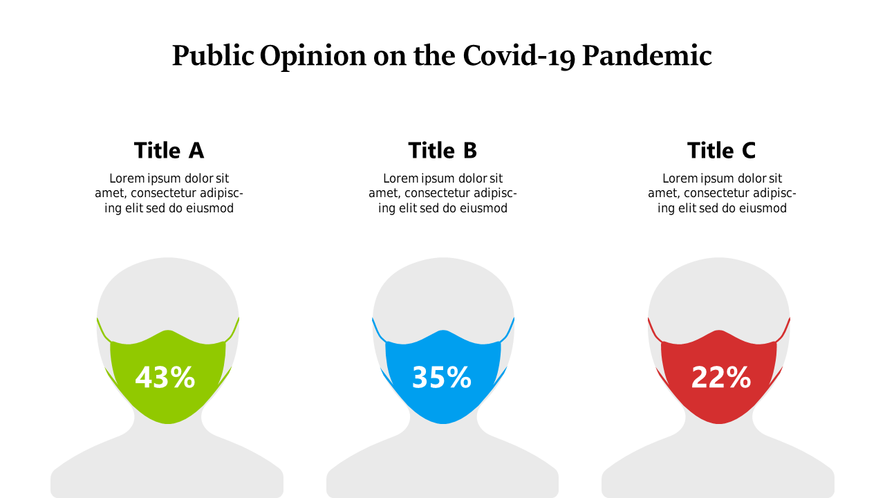
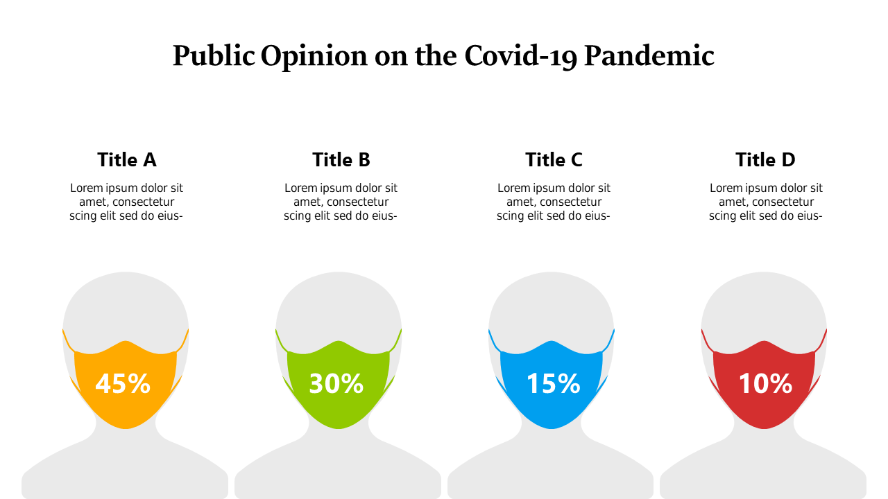
Visualize public opinion data on COVID-19 with this side-by-side comparison layout.
View full slide →
✓
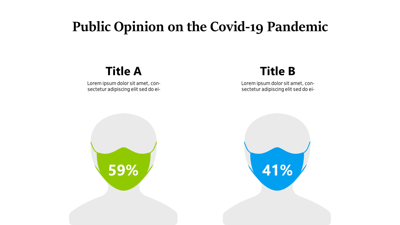
Showcase differing public opinions on COVID-19 with this clear visual layout.
View full slide →
✓
Visualize public opinion on COVID-19 with a segmented bar chart layout.
View full slide →
✓
Present demographic insights on COVID-19 using this editable bar chart layout.
View full slide →
✓
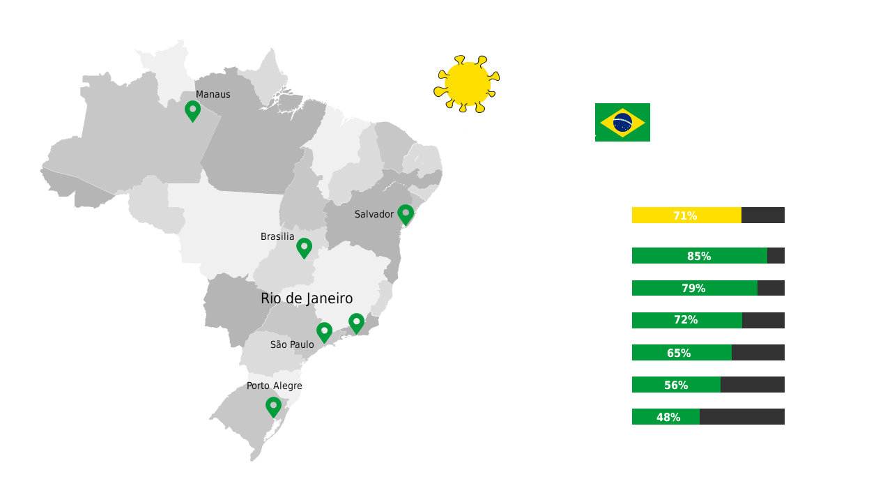
Visualize regional health metrics in Brazil using impactful maps and icons.
View full slide →
✓
Present provincial COVID-19 vaccination rates in Canada with an editable map for clarity.
 SlideSwift