Showing 365 slides
in Data Visualization

View full slide →
✓
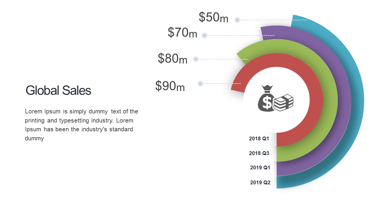
Present financial performance clearly with a curved multi-quarter revenue visualization.
View full slide →
✓
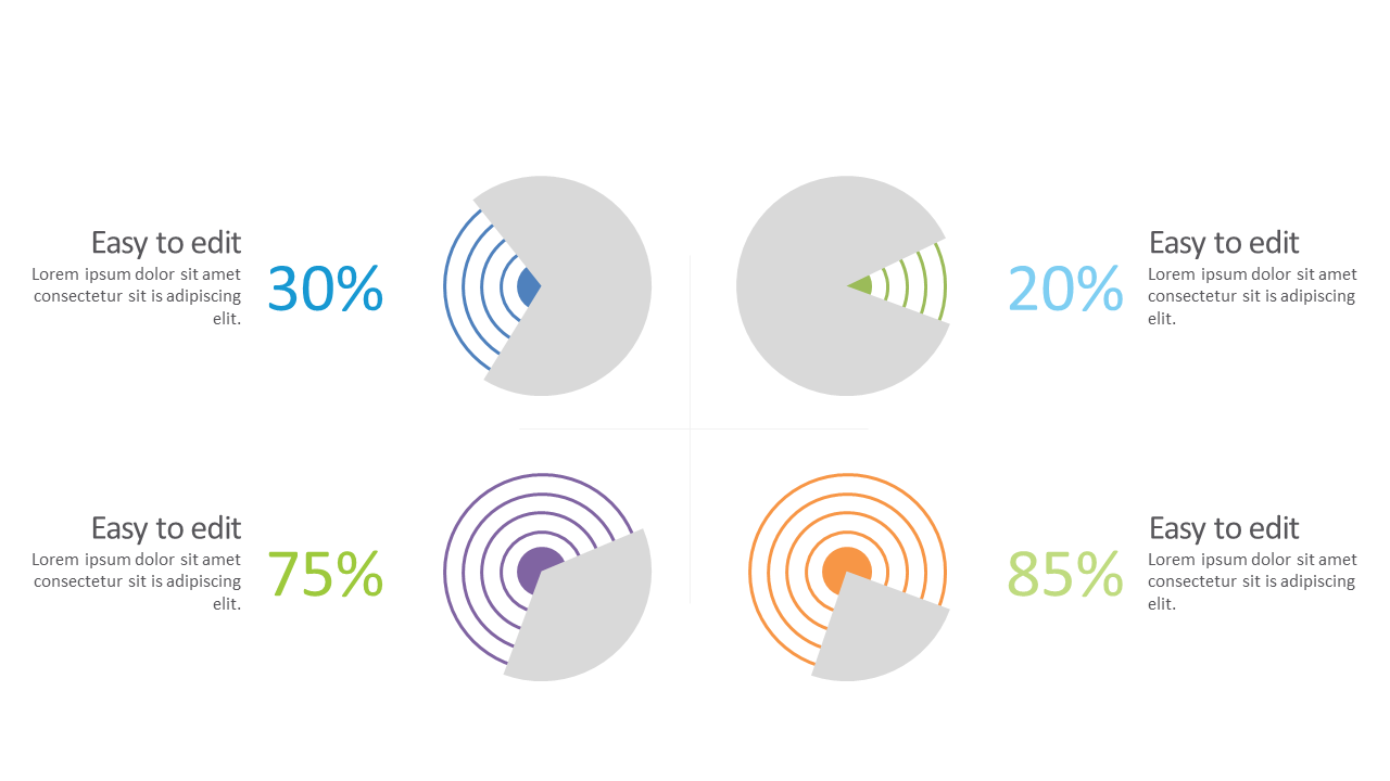
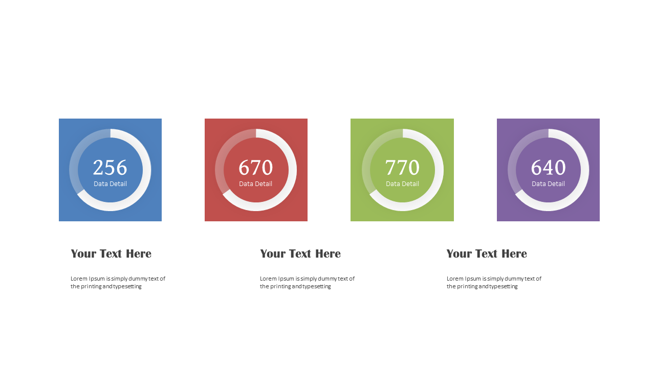
Present performance metrics clearly using circular progress indicators in presentations.
View full slide →
✓
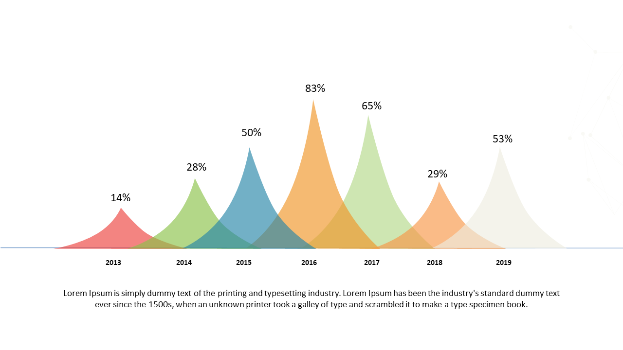
Present data trends effectively using a colorful bell curve layout for analysis.
View full slide →
✓
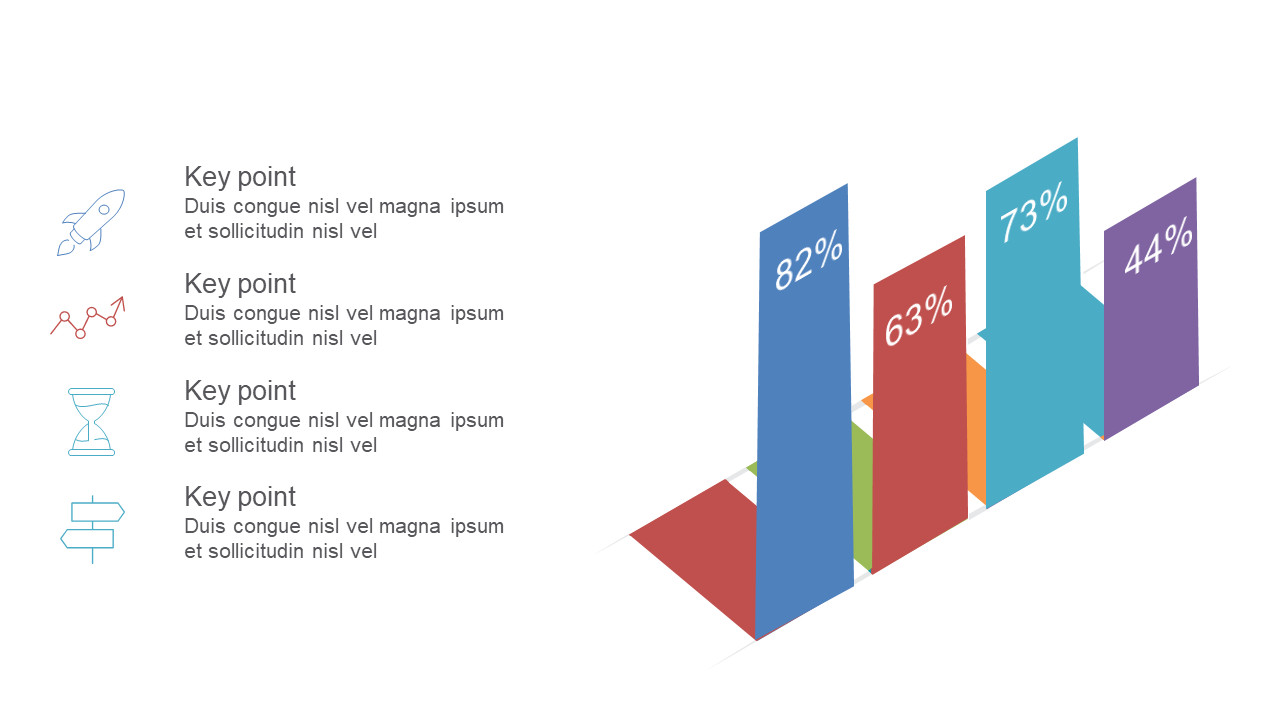
Utilize a 3D bar graph to effectively present quantitative data insights in PowerPoint.
View full slide →
✓
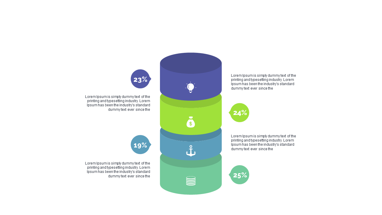
Present percentage data clearly with a three-tiered circular layout for business reports.
View full slide →
✓
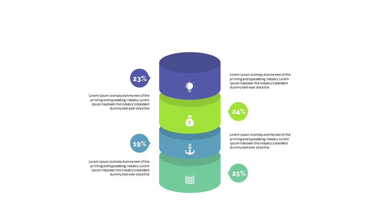
Effectively visualize survey results using a three-tiered circular percentage layout.
View full slide →
✓
Engage your audience with a radial progress circle for visualizing performance metrics.
View full slide →
✓
Engage your audience with a quadrant data visualization featuring circular progress indicators.
View full slide →
✓
Showcase performance statistics clearly using a quadrant layout with circular indicators.
View full slide →
✓
Effectively present key metrics using a quadrant layout with circular progress indicators.
View full slide →
✓
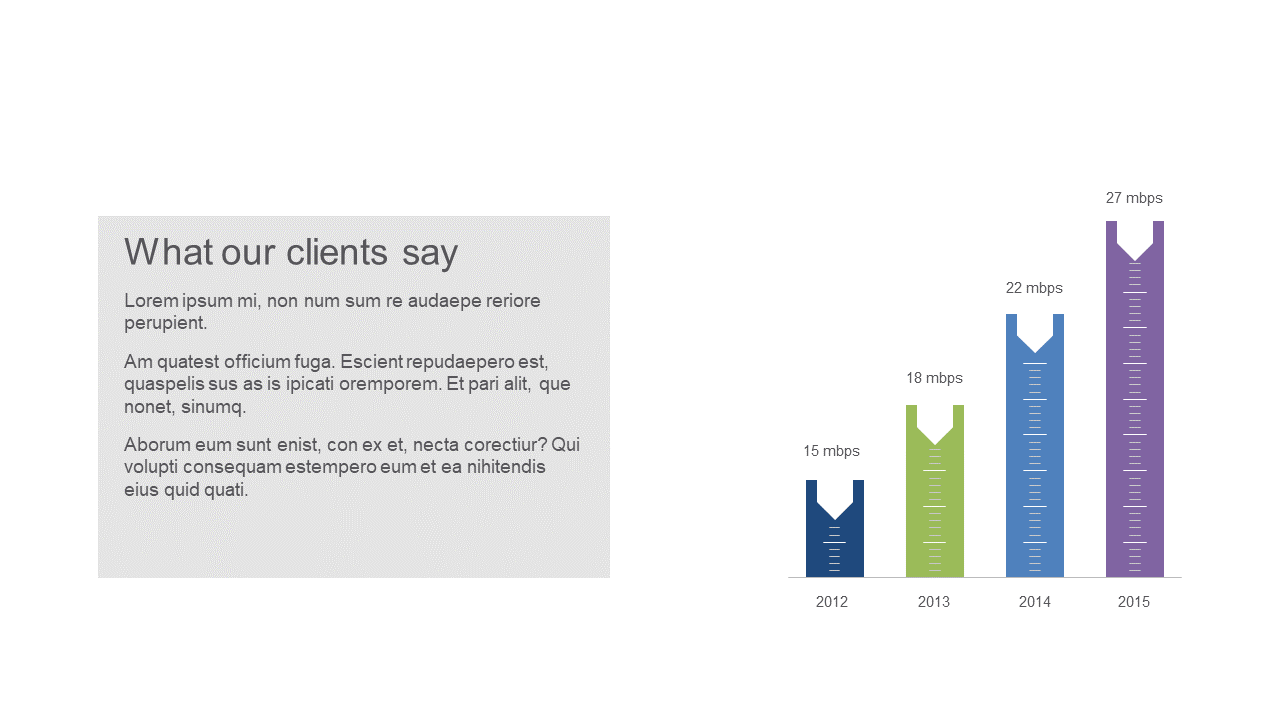
Showcase customer satisfaction trends alongside performance metrics.
View full slide →
✓
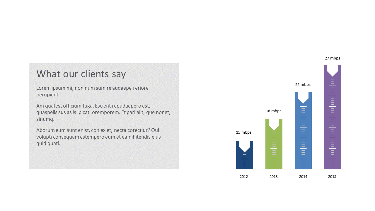
Highlight customer satisfaction effectively using bar chart visuals.
 SlideSwift