SlideSwift
By Category
💼Business 📊Infographics □Minimal 🕐Timelines ✨Neumorphic 🗑Diagrams 🔄Flow Charts ✨Glassmorphism 🎨Creative 🌍Abstract 🔄Cycle Diagrams 💎Isometric 🖼Illustrations 📱Social Media 🗺MapsBy Slide Type
🚀Pitch Deck 📌Roadmap 🔍SWOT Analysis 📅Timeline 📈Gantt Chart 🏢Org Chart 📋Funnel ⚖Comparison 📄Case Study 📋Agenda ⭐Icons & Lists 👏Thank You
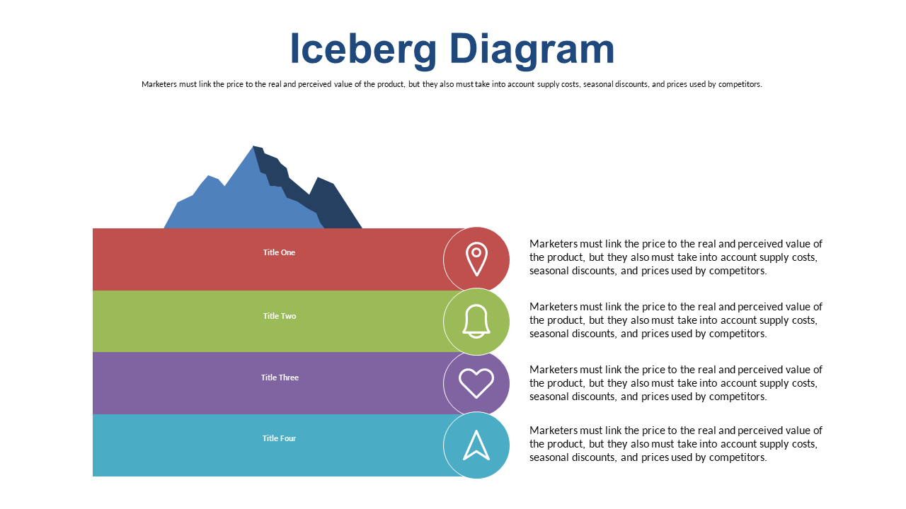
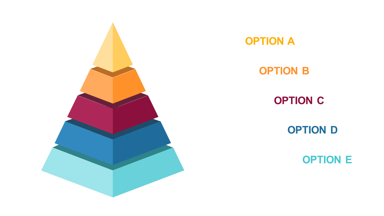
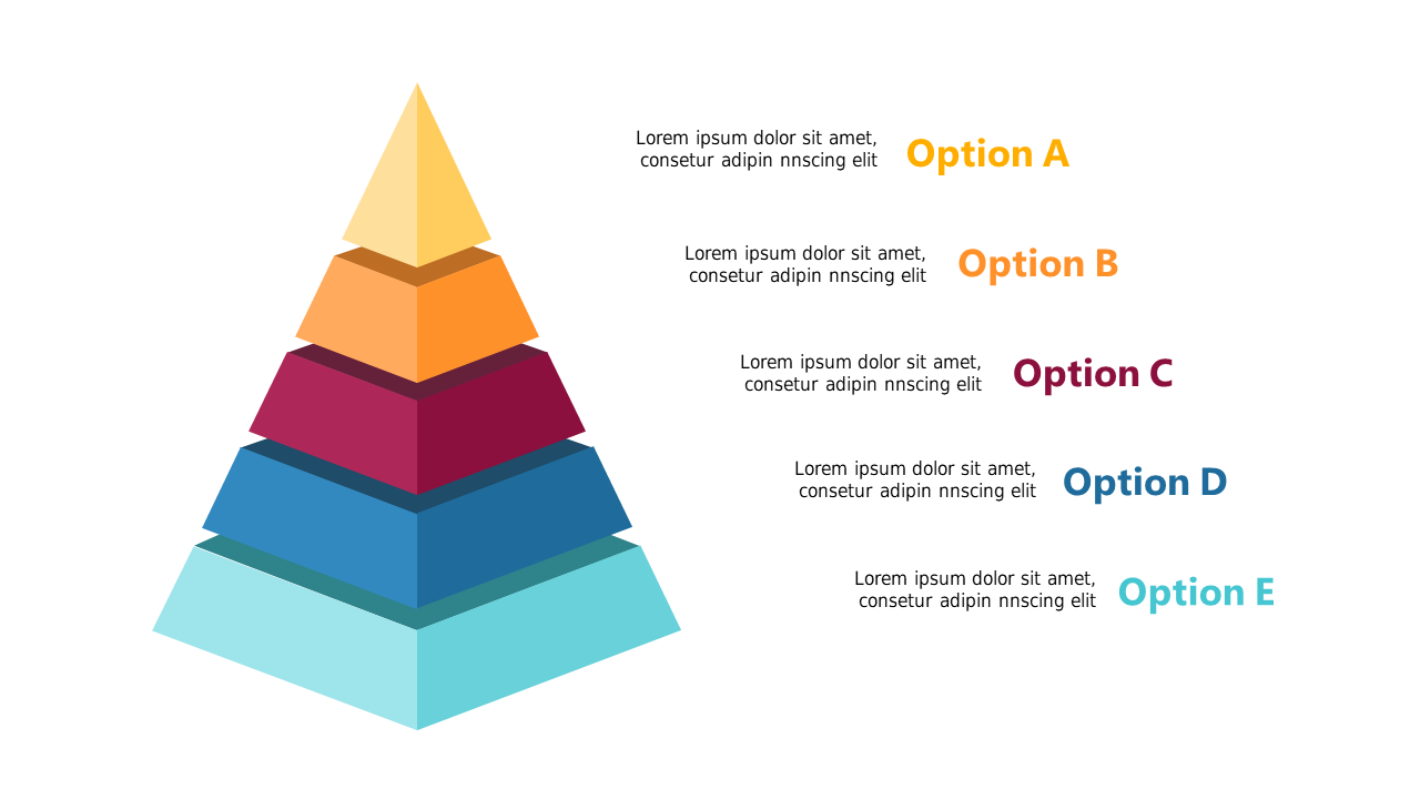
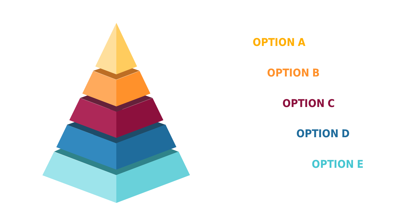
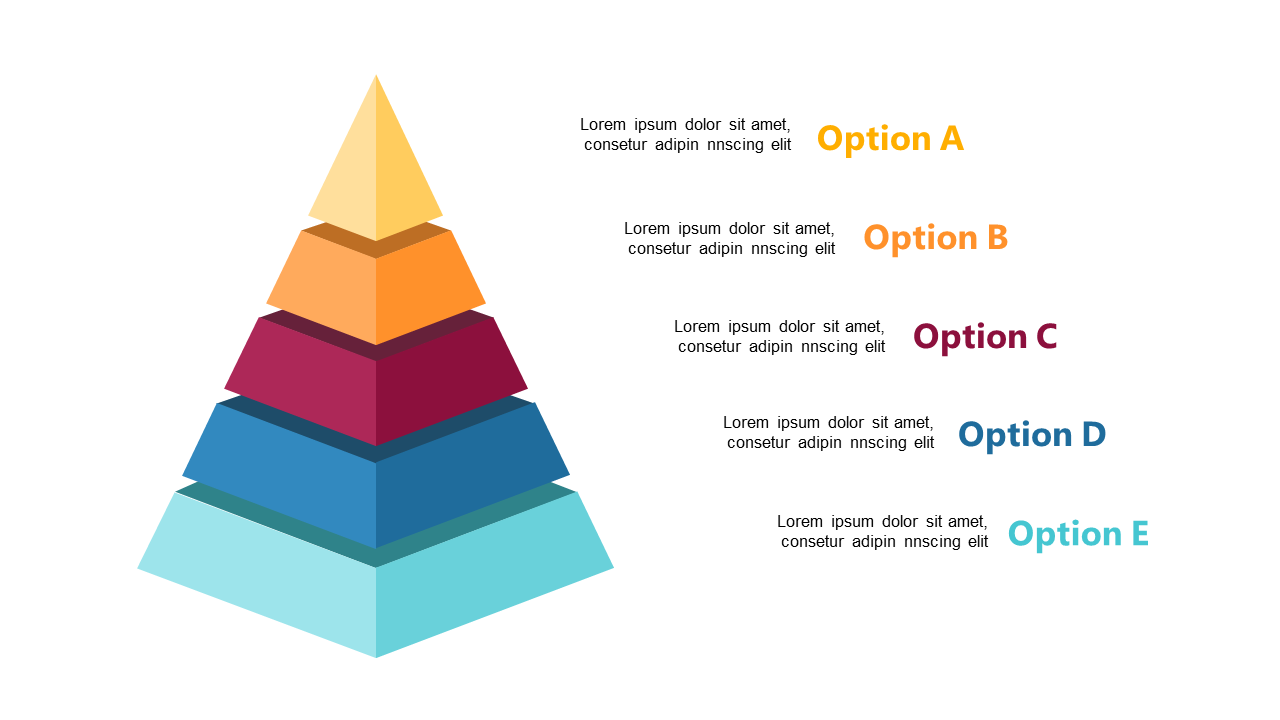
Understanding value can be tricky, especially when stakeholders have differing perceptions. The Iceberg Diagram provides a clear visual representation of the gap between perceived and real value, with a striking mountain peak and colorful text blocks that draw attention. This slide is not just visually appealing; it’s designed to enhance your communication by simplifying complex concepts. An operations manager can use this slide to present findings in a meeting, clearly showing how operational efficiency affects perceived value. A business analyst might find it perfect for illustrating data insights that reveal discrepancies between what customers think they want and what they actually need. Additionally, an architect can leverage this diagram to convey the difference between initial impressions of a design and its underlying functionality. With editable text areas and customizable colors, you can easily adapt this slide to match your branding. $0.99 — add this single slide to any deck from the SlideSwift Slide Library. No subscription needed. Mix slides from any category to build your perfect deck.
Add more from this category to your custom deck