
Why Your Data Slides Are Losing the Room in 2026
“I lost track around slide 12.” “I couldn’t tell what the main point was.” “The charts were too small to read.” Sound familiar? Data presentations are the hardest type of business slide to get right — because the instinct is to show all the data, which is the opposite of what works.
In 2026, US executives are reading decks on iPhones, not projectors. AI tools are generating insights in seconds. And audiences expect the conclusion before the chart — not after. The old way of presenting data is costing you the room before you even get to slide 5.
Here are 6 rules that data analysts, finance teams, and operations managers across the US are using right now to make data presentations that actually land.
Rule 1: Lead With the Insight, Not the Data
This is the biggest shift in how top US professionals present data in 2026. Most presenters show the data first and explain what it means at the end — the audience spends the whole time trying to figure out what they’re looking at. Flip it: open with the insight (“Our retention dropped 12% in Q3, and here’s exactly why”), then show the data that backs it up. Your audience will follow the chart far more clearly when they already know what story it’s telling.
This approach mirrors how AI-generated summaries work — conclusion up front, evidence below. Train your audience the same way.
Rule 2: One Metric, One Slide
Don’t put 6 KPIs on one slide. Each metric you want your audience to understand and remember gets its own slide. A large number, a supporting chart, a one-line interpretation. That’s the entire slide. Simple, focused, unmistakable — and mobile-friendly, since executives are increasingly reviewing decks on phones before meetings.
Rule 3: Your Chart Headline Is the Conclusion
Never show a chart with a vague title like “Q3 Results.” The headline should state the finding: “Revenue grew 34% YoY — driven entirely by enterprise accounts.” Your audience should be able to read just the slide headlines and understand the full story of your presentation without seeing any charts. That’s the test. If your headlines don’t pass it, rewrite them.
Rule 4: Highlight the One Number That Matters
In any chart, there is one data point that matters most for your argument. Color it differently. Add a callout box. Make it visually distinct from everything else on the slide. In 2026, the trend is toward “Data Simplification” — Donut Charts, Sankey Diagrams, and single-metric spotlight slides that eliminate visual noise and put one number center stage. Don’t make your audience hunt for the figure you’re about to talk about.
Rule 5: Use the Right Chart for the Right Data
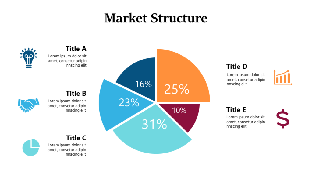
Bar charts for comparing categories. Line charts for showing change over time. Pie charts only for part-to-whole relationships, and only with 5 or fewer segments. Scatter plots for showing correlation. Sankey diagrams for showing flow between stages (popular in US funnel and retention analysis right now). Using the wrong chart type signals that you don’t fully understand your own data — and senior stakeholders will notice.
One fast-rising format in 2026: the Bento Grid slide — modular boxes that organize multiple related metrics on one canvas without the clutter of a traditional dashboard. Think Apple product pages translated to PowerPoint.
Rule 6: Strip Out Chart Junk
“Chart junk” is any element that doesn’t add information: gridlines, background fills, 3D effects, unnecessary data labels, legends that could be incorporated directly into the chart. Every element you remove makes the actual data more prominent. Edward Tufte called this maximizing the data-ink ratio — and in 2026, the cleanest slides are consistently the most credible ones in the room.
If you’re using dark mode slides (now standard for tech, finance, and executive briefings in the US), this rule matters even more — clutter disappears faster on dark backgrounds, but so does your key data if it isn’t designed to stand out.
The 2026 Data Slide Stack That Works
Top US teams are combining these rules into a repeatable slide structure for every data point:
- Slide title = the conclusion (“Churn increased 18% in Q2”)
- Hero number = large, prominent, center-frame
- Supporting chart = simplified, one key data point highlighted
- One-line context = what this means for the decision at hand
Four elements. One slide. Nothing else. This is the format that works whether you’re presenting to a board, a client, or your own team.
Ready-to-Use Data Presentation Templates
Every rule above is already built into these slide layouts — clean charts, headline-first structure, Light + Dark themes, KPI spotlight slides, and Bento Grid-style dashboard layouts designed for US business audiences.
- Browse Charts, KPI and Dashboard Templates →
- Light + Dark themes, from $9 — built for finance, ops, and executive decks
Need just one or two specific data slides? Use Slide Picker to hand-pick individual chart or KPI slides from 7,486+ designs at $0.99 per slide. No subscription required.