
Why Chart Selection Is a Credibility Issue
Walk into any business meeting in the US and you’ll see the same mistake on repeat: a pie chart trying to show a trend over time. A line chart comparing things that have no relationship to each other. A bar chart with 22 bars squeezed onto a single slide that nobody past the third row can actually read.
Here’s the thing — using the wrong chart doesn’t just confuse your audience. It signals something worse: that you may not fully understand your own data. In a room full of analysts, finance people, or senior leadership, that’s a credibility problem that’s hard to recover from.
Chart selection isn’t a design decision. It’s a communication decision. The right chart makes your argument obvious before you say a word. The wrong one makes your audience work to find the point — and most of them won’t bother. They’ll nod, smile, and move on with zero conviction.
Here are the seven chart types that US analysts, strategists, and finance teams actually use — what each one is for, when to reach for it, and the mistakes that will get you called out in the room.
1. Bar Chart — Comparing Categories Side by Side
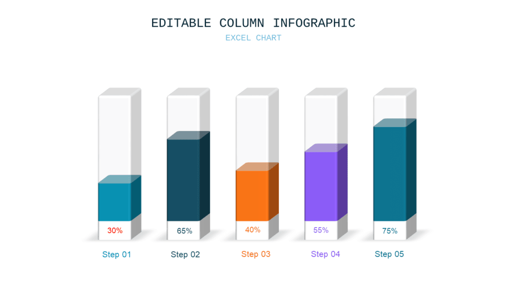
The bar chart is the workhorse of every business presentation, and for good reason: it’s the most readable way to compare discrete things. Revenue by region. NPS scores by product line. Headcount by department. Q1 vs. Q2 vs. Q3. If you’re asking “which one is bigger?” — a bar chart is almost always the right answer.
A quick rule of thumb: use vertical bars (column charts) when you have fewer categories and want to emphasize magnitude. Switch to horizontal bars when your labels are long — they’re easier to read left to right and your audience won’t have to tilt their heads.
The mistake that gets you called out: Too many bars. Past 7 or 8 categories, your audience can’t actually compare — they’re just scanning a wall of rectangles. If you have 15 product lines, group the smaller ones into an “Other” bucket. If you can’t do that, reconsider whether a bar chart is the right format at all.
2. Line Chart — Showing What’s Happening Over Time
Any time your data has a time dimension — monthly revenue, weekly active users, daily ticket volume, quarterly churn — a line chart is almost always the right call. The slope of the line tells the story before anyone reads a single number. Rising line: growth. Falling line: decline. Flat line: stagnation or stability, depending on what you’re hoping for.
The reason line charts work so well for time-series data is that the human eye is wired to follow a path. Your audience processes the trend in under a second, which means you can spend your actual presentation time talking about why instead of explaining what.
The mistake that kills your credibility: Truncating the y-axis to make a small change look dramatic. Starting at 94% instead of 0% to make a 3-point improvement look like a hockey stick. US finance and analyst audiences will spot this immediately. It doesn’t just look like a mistake — it looks like you’re trying to mislead them. Start your axis at zero unless there’s a genuinely good reason not to, and if you don’t start at zero, label it clearly.
3. Stacked Bar Chart — Totals and Composition at the Same Time
The stacked bar chart earns its place when you need to show two things simultaneously: how the total changes over time, and how the mix of components shifts within that total. Revenue broken down by product line across quarters. Headcount split by team over three years. Customer base segmented by tier as the company grows.
The total bar height shows the aggregate. The color segments inside show the composition. When both stories matter — not just the total, and not just the mix — this is your chart.
That said, use it sparingly. Stacked bars are harder to read than simple bars because only the bottom segment has a consistent baseline. Everything above it floats, which makes precise comparisons across periods difficult. Only reach for this format when the composition story is genuinely as important as the total story. If it’s not, just use a regular bar chart.
4. Waterfall Chart — Explaining How You Got from A to B
If you’ve sat through a financial presentation, a consulting readout, or a budget review in the US, you’ve seen a waterfall chart. It’s the standard format for showing how individual components add up to a total — or how a starting value changes through a series of additions and subtractions to arrive at an ending value.
Revenue bridge charts are the most common application: “We started the year at $42M. We added $8M from new customers, lost $3M from churn, gained $5M from expansion, and ended at $52M.” A waterfall chart makes that progression visual and immediately auditable. Same logic applies to P&L walkthroughs, budget variance explanations, and valuation bridges in M&A or investment decks.
If you’re presenting to a US finance or strategy audience and you’re not using waterfall charts for bridge analysis, you’re doing it the hard way.
5. Scatter Plot — Showing Whether Two Things Are Related
A scatter plot answers one question: is there a relationship between these two variables? Ad spend vs. revenue. Employee tenure vs. satisfaction score. Price vs. conversion rate. Store size vs. foot traffic. Each dot represents one data point. The pattern of dots — clustered, spread, sloping up, sloping down — reveals the relationship, or the lack of one.
For data-savvy audiences — analytics teams, data scientists, senior strategy, quantitative investors — scatter plots are expected and respected. They signal that you’re working with actual data and not just summarizing it.
For general business audiences, use them carefully. Always explain what both axes represent before you talk about the pattern. If your audience is still figuring out what they’re looking at, they’re not listening to your interpretation.
6. Donut / Pie Chart — Breaking Down a Whole at One Point in Time
Pie and donut charts have exactly one legitimate use case: showing how a whole is divided into parts at a single moment in time. Market share split. Budget allocation across departments. Survey response distribution. If your question is “what percentage of the whole does each part represent right now?” — this format works.
The rules, non-negotiable: never more than five segments (after that, the slices get too small to compare), always label the percentages directly on the chart rather than in a legend that requires eye-darting, and never use a 3D version under any circumstances. 3D pie charts visually distort the size of segments based on their angle — the front slices look bigger than they are. It’s been a known issue for 30 years and it still shows up in decks constantly.
Donut charts — pie charts with a hole cut out of the center — are currently the more popular format in US business decks, partly because the center gives you a place to display a single key number (total customers, total revenue, overall percentage) that anchors the chart.
7. Heatmap — Seeing Intensity Across Two Dimensions at Once
Heatmaps are showing up more and more in US strategy, operations, and logistics presentations, and once you understand what they do, it’s obvious why. A heatmap is a grid where the color of each cell represents a value — the darker or more saturated the color, the higher the number. You can show performance across regions and time periods simultaneously. You can show which product-channel combinations are working and which aren’t. You can show where customer density is highest across a 50-state map.
The US regional heatmap — showing sales density, store performance, or customer concentration by state — is one of the most common applications in retail, real estate, logistics, and any business with geographic distribution. It communicates in a second what a table of 50 state-by-state numbers can’t.
Heatmaps work best for analytical audiences who are comfortable reading them. If you’re presenting to a mixed audience, add a brief sentence explaining how to read the color scale before you move on.
One More Thing: Slide Design Matters Too
You can pick the right chart type and still lose the room if your slide is cluttered, your colors clash, or your chart is too small to read from the back. The mechanics of good chart selection are only half the job. The other half is how your slide is designed around the chart — the whitespace, the font size, the color choices, the label placement.
If you’re building decks that need to land with a US business audience, every chart type covered in this post is available as a professionally designed, fully editable PowerPoint slide — bar charts, stacked bars, waterfall charts, scatter plots, donut charts, and US regional heatmaps, in both Light and Dark themes, across six color palettes.
- Browse Chart & Data Visualization Templates →
- Light + Dark themes, 6 color options, from $9 per deck
Need just one chart slide rather than a full deck? Pick individual chart slides from the Slide Library at $0.99 each — 7,486+ designs, no minimum.