SlideSwift
By Category
💼Business 📊Infographics □Minimal 🕐Timelines ✨Neumorphic 🗑Diagrams 🔄Flow Charts ✨Glassmorphism 🎨Creative 🌍Abstract 🔄Cycle Diagrams 💎Isometric 🖼Illustrations 📱Social Media 🗺MapsBy Slide Type
🚀Pitch Deck 📌Roadmap 🔍SWOT Analysis 📅Timeline 📈Gantt Chart 🏢Org Chart 📋Funnel ⚖Comparison 📄Case Study 📋Agenda ⭐Icons & Lists 👏Thank You
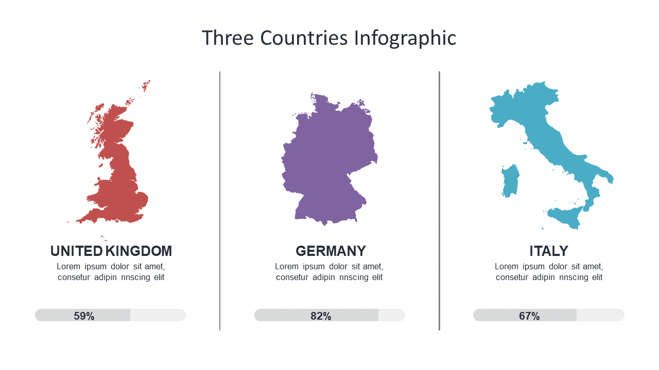
When tasked with presenting complex data, communications leads often struggle to find the right visual format. This infographic slide presents a clean and engaging layout, showcasing three country outlines with corresponding percentage data. It’s designed to make comparisons intuitive at a glance. A communications lead can easily use this slide to illustrate key performance indicators across regions during a quarterly meeting. Meanwhile, a content strategist can leverage the infographic to highlight market differences in a report, making insights easy to digest for stakeholders. Similarly, a marketing manager can insert this slide into a campaign presentation to showcase target market statistics in different countries, driving home the importance of location-specific strategies. The design is fully customizable, allowing you to input your own data and adjust colors to match your brand. $0.99 — add this single slide to any deck from the SlideSwift Slide Library. No subscription needed. Mix slides from any category to build your perfect deck.
Add more from this category to your custom deck