SlideSwift
By Category
💼Business 📊Infographics □Minimal 🕐Timelines ✨Neumorphic 🗑Diagrams 🔄Flow Charts ✨Glassmorphism 🎨Creative 🌍Abstract 🔄Cycle Diagrams 💎Isometric 🖼Illustrations 📱Social Media 🗺MapsBy Slide Type
🚀Pitch Deck 📌Roadmap 🔍SWOT Analysis 📅Timeline 📈Gantt Chart 🏢Org Chart 📋Funnel ⚖Comparison 📄Case Study 📋Agenda ⭐Icons & Lists 👏Thank You
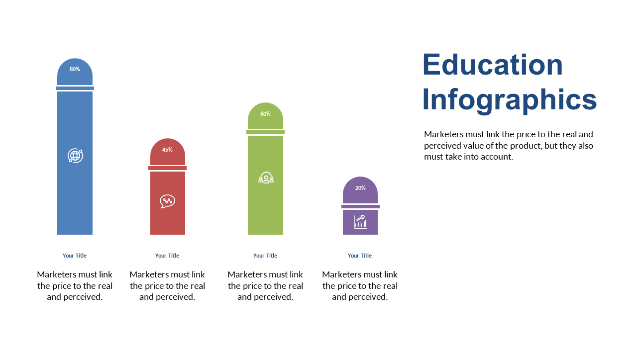
Are you struggling to present marketing metrics in a way that captures attention? Visualizing data can be challenging, especially when you want to make an impact. This slide showcases a dynamic bar chart with vertical bars and percentage labels, allowing your audience to quickly grasp key metrics at a glance. The sleek design is perfect for conveying comparisons between different values, making it an excellent choice for any presentation. As a visual designer, you can use this slide to create compelling visuals that tell a story with data. For communications leads, this chart can simplify complex information, helping you effectively communicate insights to stakeholders. Content strategists will find this slide invaluable for showcasing content performance metrics, allowing for informed decision-making. Plus, you can easily customize the colors and text to match your brand’s aesthetics. $0.99 — add this single slide to any deck from the SlideSwift Slide Library. No subscription needed. Mix slides from any category to build your perfect deck.
Add more from this category to your custom deck