SlideSwift
By Category
💼Business 📊Infographics □Minimal 🕐Timelines ✨Neumorphic 🗑Diagrams 🔄Flow Charts ✨Glassmorphism 🎨Creative 🌍Abstract 🔄Cycle Diagrams 💎Isometric 🖼Illustrations 📱Social Media 🗺MapsBy Slide Type
🚀Pitch Deck 📌Roadmap 🔍SWOT Analysis 📅Timeline 📈Gantt Chart 🏢Org Chart 📋Funnel ⚖Comparison 📄Case Study 📋Agenda ⭐Icons & Lists 👏Thank You
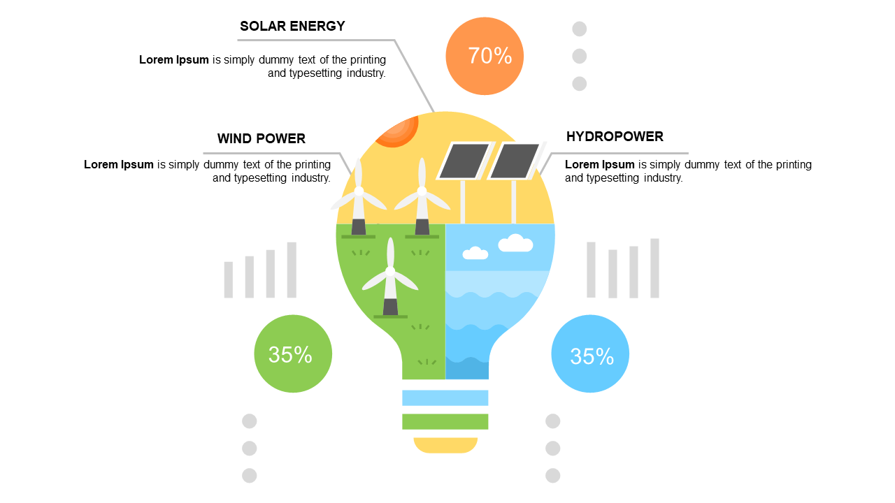
When you’re tasked with conveying complex information quickly, a clear visual representation can make all the difference. This pie chart slide illustrates the contribution of various energy sources, such as solar, wind, and hydropower, in a visually engaging way that’s easy for your audience to grasp. With vibrant colors and intuitive design, it transforms dense data into insights that resonate.
As a visual designer, you can use this slide to create impactful presentations that showcase your understanding of energy trends. For a communications lead, this chart simplifies the message for stakeholders, making data-driven discussions more efficient. A content strategist can leverage this infographic to enrich articles or reports about energy contributions, enhancing reader engagement with compelling visuals.
Customization is straightforward, allowing you to edit percentages and descriptions to fit your specific needs. $0.99 — add this single slide to any deck from the SlideSwift Slide Library. No subscription needed. Mix slides from any category to build your perfect deck.
Add more from this category to your custom deck