SlideSwift
By Category
💼Business 📊Infographics □Minimal 🕐Timelines ✨Neumorphic 🗑Diagrams 🔄Flow Charts ✨Glassmorphism 🎨Creative 🌍Abstract 🔄Cycle Diagrams 💎Isometric 🖼Illustrations 📱Social Media 🗺MapsBy Slide Type
🚀Pitch Deck 📌Roadmap 🔍SWOT Analysis 📅Timeline 📈Gantt Chart 🏢Org Chart 📋Funnel ⚖Comparison 📄Case Study 📋Agenda ⭐Icons & Lists 👏Thank You
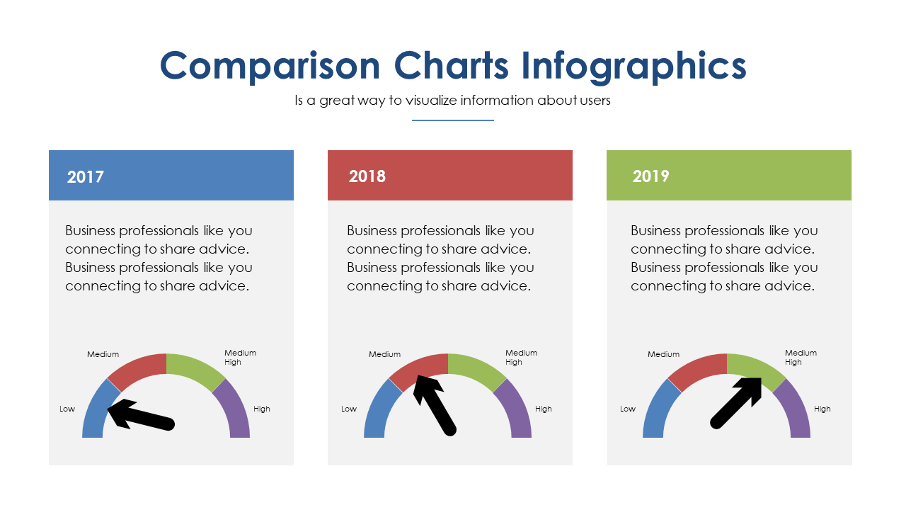
When presenting user insights, visual clarity is essential but often overlooked. This slide utilizes three comparison charts that efficiently display user insights across three years, making it easy to highlight trends and shifts at a glance. With a clean and simple layout, the charts are designed to ensure your audience can quickly grasp the information. For a visual designer, this slide serves as a powerful tool to convey complex data clearly and succinctly. A communications lead can utilize this slide to support narratives around user behavior, making the presentation more engaging and informative. Meanwhile, a content strategist can leverage these charts to identify key insights and trends that inform content direction. Customization is straightforward, allowing you to input your own data and insights to make the charts relevant to your specific needs. $0.99 — add this single slide to any deck from the SlideSwift Slide Library. No subscription needed. Mix slides from any category to build your perfect deck.
Add more from this category to your custom deck