
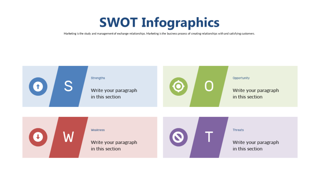
The Problem With Most SWOT Slides
A four-box grid. Each box filled with 6–8 bullet points. Default blue title bar. This is how 90% of SWOT analysis slides look in US business presentations — and they fail at the one thing a SWOT slide is supposed to do: spark strategic thinking.
A SWOT analysis isn’t a homework assignment to fill in all the boxes. It’s a conversation tool. The design should facilitate that conversation — not just document the output of it.
What a Well-Designed SWOT Slide Actually Does
It prioritizes ruthlessly. Your most important strength — the one your strategy should be built around — should be visually dominant. Your most dangerous threat should be highlighted, not buried in a list. If everything is equal in size and weight, nothing stands out. And if nothing stands out, no decision gets made.
Good SWOT slide design answers three questions at a glance:
- What is our single biggest advantage right now?
- What is the one threat we cannot ignore?
- What action does this analysis demand?
5 SWOT Slide Layouts That Actually Work
1. Classic 2×2 Grid (Redesigned)
The standard layout — but done right. Strong typography, one highlight color per quadrant for the most critical item, and generous whitespace. Clean, universally understood, and hard to mess up when the visual hierarchy is intentional.
2. Weighted SWOT
Each quadrant is sized differently based on relative importance or number of items. Immediately shows what matters most — without anyone having to read every bullet point. Best for executive presentations where time is limited.
3. SWOT With Action Bridge
Adds a fifth section showing SO combinations (Strength + Opportunity → what to pursue) and WT combinations (Weakness + Threat → what to defend). This turns the SWOT from a diagnostic into a decision-making tool. The most underused layout in business strategy.
4. Icon-Based SWOT
Each item gets a simple icon alongside the text. Faster to scan, easier to remember, and more engaging for mixed or non-analytical audiences. Works especially well in all-hands or investor presentations.
5. Circular SWOT
Four segments of a circle instead of a grid. The circular layout visually implies that all four elements are interconnected — a useful framing when you want the team to think about how strengths can offset threats, or how weaknesses interact with opportunities.
Common SWOT Slide Mistakes to Avoid
- Too many items per quadrant — if you have 10 strengths listed, none of them are the strength. Pick 3 maximum per box.
- No visual hierarchy — all items in the same font size and color means no item is more important than any other. Use bold, color, or size to signal priority.
- No “so what” — a SWOT slide without a next step or strategic implication is just a list. Always pair it with an action or conclusion slide.
Ready-Made SWOT Slide Templates
If you want a professional SWOT slide without building from scratch, SlideSwift has individual SWOT slides available from $0.99 — no subscription, instant PowerPoint download.
- Browse Business Strategy slides →
- Available in Light + Dark themes, 6 color variants
- Mix with any other slides — build your own custom deck