
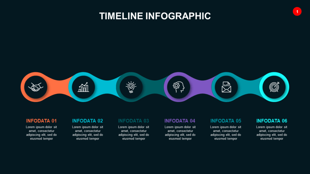
The Problem With Most Roadmap Slides
Most roadmap slides fail before the presenter says a word. They show a cluttered timeline, a wall of milestone boxes, and a color legend that nobody stops to decode. The audience walks out of the room unsure whether the project is on track, behind schedule, or just wishful thinking dressed up in PowerPoint.
A roadmap slide has exactly one job: show where you are, where you’re going, and why that path makes sense. Everything else is noise. Here’s how product managers, consultants, and US business teams actually build roadmap slides that earn real stakeholder buy-in — not polite nods followed by no action.
What a Roadmap Slide Is Actually For
Before you open PowerPoint, get clear on the purpose. A roadmap slide is not a project plan. It’s not a Gantt chart. It’s not a status report. It’s a strategic communication tool — your one chance to show decision-makers that you have a credible plan and you need something specific from them: approval, budget, resources, or patience.
A project plan serves the executor. A roadmap slide serves the decision-maker. That distinction changes everything about how you design it. Strip out granular task lists, responsible parties, and sub-tasks. Keep only what someone at the VP, Director, or C-suite level needs to understand in under 60 seconds.
What decision-makers actually want to know from your roadmap slide:
- Are we on track or behind?
- What are the next major milestones?
- What risks or decisions are coming that need their attention?
- How long until we see results?
Design your slide around those four questions and you’ll be ahead of 90% of the roadmap presentations out there.
The 4-Part Structure That Works Every Time
Every effective roadmap slide — whether you’re presenting to a board, a client, or a cross-functional leadership team — follows a version of this structure. Industry and company size don’t change the fundamentals.
1. Time Axis
Horizontal timelines almost always outperform vertical ones. Left-to-right reads naturally for US audiences and mirrors how we process schedules, calendars, and plans. Vertical timelines work in written documents but feel awkward on a presentation screen.
Use quarters (Q1, Q2, Q3, Q4) rather than specific dates unless your dates are contractually locked. Here’s why: quarters signal a strategic plan; specific dates signal a commitment you may regret. “Q2” gives you room. “May 17” does not. Most roadmap presentations that backfire do so because someone put an optimistic exact date in front of leadership — and then had to explain why that date slipped.
If you’re presenting a multi-year roadmap (common in enterprise software or infrastructure projects), use half-years (H1/H2) for anything beyond 12 months. The further out the horizon, the less useful exact timing becomes.
2. Swim Lanes or Phases
If your project involves multiple workstreams — product, marketing, customer success, engineering, legal — give each one a horizontal swim lane. Swim lanes let stakeholders from different functions quickly find what’s relevant to their world without reading the entire slide.
If your project is a single track (a product launch, a rebrand, an internal initiative), use phases instead of swim lanes: Discovery → Build → Launch → Optimize. Phases make your roadmap feel strategic rather than tactical. They communicate that you’ve thought through the progression, not just listed tasks in order.
Pro tip: Don’t use more than four swim lanes or five phases on a single slide. Beyond that, you’re building a project plan, not a roadmap. Put the detail in an appendix and reference it if asked.
3. Milestones
Milestones mark the moments that matter — a product launch, a board decision, a beta go-live, a contract renewal, a regulatory filing. They’re not tasks; they’re events. Use a consistent visual marker (diamond, dot, or flag) and label each one clearly with a short noun phrase, not a verb: “Beta Launch,” not “Launch the Beta.”
Three to five milestones is the sweet spot for a single slide. More than five and the slide becomes a calendar. Less than three and it doesn’t communicate enough strategic substance. If you have 12 milestones across a year, decide which three to five are truly decision-critical and put the rest in a separate appendix slide or project document.
4. Status Indicators
Color-code for current status so the story is readable at a glance before anyone reads a word:
- Green: Completed or on track
- Amber/Yellow: At risk or slightly delayed
- Red: Blocked or significantly off track
- Gray: Not yet started / upcoming
- Blue: In progress (some teams prefer blue over green for active items)
Stakeholders read color before they read text. Make the status story unmistakable. If three swim lanes are green and one is amber, that amber lane will draw every question in the room — which is exactly where you want the conversation to go.
Real-World Example: What a Good Roadmap Slide Looks Like
Here’s a concrete example that illustrates the principles above. Imagine a SaaS company presenting a product roadmap to their board:
- Time axis: Q1–Q4 2026, horizontal, divided into four equal columns
- Swim lanes (3): Product, Marketing, Customer Success
- Milestones: Beta (Q1), GA Launch (Q2), First 100 Customers (Q3), v2.0 Kickoff (Q4)
- Status: Q1 complete (green), Q2 in progress (blue), Q3–Q4 upcoming (gray)
- Now line: A thin vertical line through mid-Q2 to show the current date
- Slide headline: “On track for GA launch — pending legal sign-off on SLA terms”
That slide answers every decision-maker question in one visual. Everything else goes in backup slides.
5 Common Roadmap Slide Mistakes US Presenters Make
Mistake 1: Too Many Milestones
If everything is a milestone, nothing is. When every two-week sprint gets a diamond on the timeline, the audience stops reading them. Pick only the events that require a decision or signal a meaningful transition. Everything else belongs in the project tracker, not the presentation.
Mistake 2: Using Exact Dates When You Don’t Have Certainty
“March 14” sounds precise. “Q1” sounds strategic. Precise-sounding dates set expectations that often can’t be met. In a US boardroom or client presentation, a missed exact date becomes a credibility issue. If your timeline is based on estimates, use quarters. When dates are locked (regulatory deadlines, contract terms, investor covenants), use exact dates — but flag explicitly that they’re fixed external constraints, not internal estimates.
Mistake 3: No “Now” Indicator
Your audience always wants to know where you are today relative to the plan. A simple vertical line showing the current date instantly answers the question everyone is privately thinking: Are we ahead of schedule, on track, or already behind? Without this marker, stakeholders have to mentally reconstruct your position from the milestone labels — and they’ll often get it wrong or assume the worst.
Mistake 4: A Generic Slide Title
Your slide title should never just say “Product Roadmap” or “Project Timeline.” Those are labels, not messages. Your title should tell decision-makers what to think before they read the slide. “On track for Q3 launch — two vendor dependencies to resolve” tells a story. “Product Roadmap” tells nothing. If leadership has only five seconds before the next question, the title is the only thing that matters.
Mistake 5: Building the Roadmap in Excel and Screenshotting It
This happens more often than anyone admits. Excel-based roadmaps look like internal tracking documents because that’s what they are. When they land on screen in a boardroom or client meeting, they signal that the team didn’t invest the 30 minutes needed to present the plan as a polished visual. Decision-makers notice. Start with a proper roadmap slide template and fill in your content — it takes less time than formatting a spreadsheet and it reads 10x better.
Roadmap Slides for Different US Business Contexts
The same core structure adapts to different presentation contexts. Here’s how to adjust based on your audience:
Board Presentations
Keep it to a single roadmap slide. Board members see dozens of decks per quarter — they reward brevity. Lead with the headline (status summary), show one clean timeline, mark the key milestones, and flag the two or three decisions or risks that need board-level attention. Everything else goes in the appendix.
Investor Updates
Investors want to see momentum. Show completed milestones (green), current focus (in progress), and the next major proof point that validates your strategy. Include a “since last update” callout if this is a recurring deck — it demonstrates execution speed, which investors weight heavily.
Client-Facing Roadmaps (Agency, Consulting, SaaS)
Clients want certainty and accountability. Use exact milestone labels with clear owners where possible. Show what they’re responsible for (client deliverables, approvals, feedback windows) vs. what you’re responsible for. If a delay is client-caused, a well-structured roadmap makes that visible without a difficult conversation.
Internal Team Roadmaps
Internal audiences can handle slightly more detail — dependencies, owners, sprint boundaries. But even internally, the roadmap slide shown to cross-functional leadership should follow the same principles: clear, visual, headline-driven. Save the granular version for the project management tool your team actually uses daily.
Light vs. Dark: Which Theme Works for Roadmap Slides?
For boardroom presentations and executive decks, dark backgrounds with high-contrast text read better on large screens and projectors. The contrast is sharper, the colors pop, and dark mode looks inherently more polished in a dimmed conference room.
For documents shared as PDFs, emailed for async review, or printed: light backgrounds are cleaner and easier to read on screens and paper. Light mode also reproduces better in black-and-white if stakeholders print your deck.
The practical move: Have both versions ready and use the right one for the context. If you’re presenting live in a room with a projector or a 65-inch screen, go dark. If you’re sending over email for review before the meeting, go light.
How Long Should a Roadmap Slide Take to Build?
If you’re building from scratch in PowerPoint, expect 45–90 minutes to get a polished roadmap slide, depending on complexity. If you’re using a pre-built template that already has the swim lane structure, color coding, milestone markers, and timeline grid set up, you’re filling in your content in 15–20 minutes. That’s the difference between a template and a blank slide.
For most US business presenters preparing for a board meeting, investor update, or client quarterly review, the time savings alone justify using a ready-made layout — before you factor in the visual quality difference.
Ready-to-Use Roadmap Slide Templates for US Business Teams
Every layout described in this guide — swim lanes, milestone markers, status color coding, quarterly timelines, Light and Dark themes — is available as a ready-made slide you can drop into any deck and edit in minutes.
- Browse Roadmap and Timeline Templates →
- Light + Dark themes, 6 color options, from $9
Need just one roadmap slide? Use Slide Picker to pick individual roadmap slides at $0.99 each. No subscription, no bundle required — just the slide you need.