
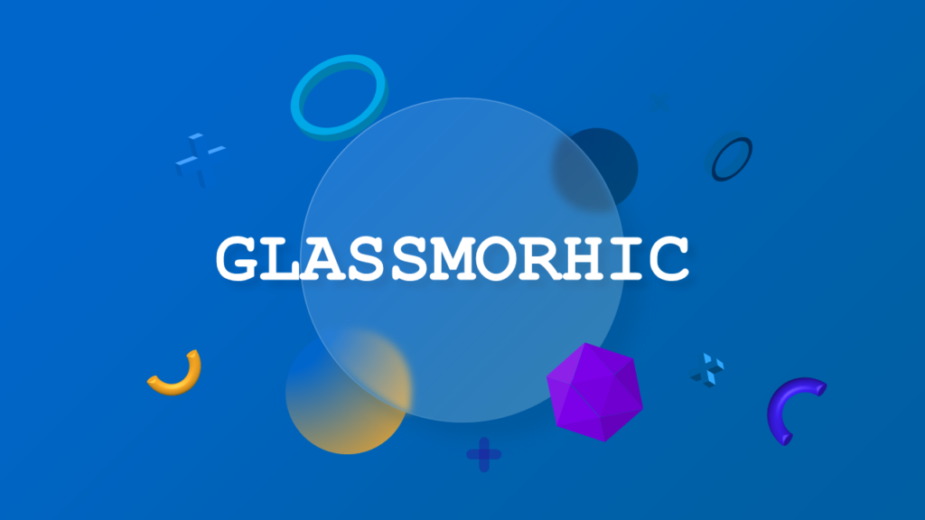
What Is Glassmorphism in Presentation Design?
Glassmorphism is a UI design trend where interface elements
appear to be made of frosted glass — semi-transparent surfaces,
subtle blur effects, soft glowing borders, and layered depth.
You’ve seen it in macOS Big Sur, iOS 16 widgets, Windows 11
panels, and modern SaaS dashboards. In 2026, it’s moved from
UI design into PowerPoint — and it’s changing what “professional
presentation” looks like.
A glassmorphism PowerPoint slide creates immediate visual
impact. Instead of flat boxes and solid color blocks, your
content appears to float — layered, spatial, premium. For
anyone presenting to a tech-forward US audience, this aesthetic
signals design sophistication before you’ve said a word.
Why Glassmorphism Works So Well on Dark Backgrounds
Glassmorphism was born from dark-mode UI design — and the
physics of the effect explain why. The frosted glass transparency
only registers visually when there’s a rich, colorful background
behind it. On a white slide, the same blur and opacity settings
are nearly invisible. On a dark navy, deep charcoal, or gradient
background, the glass panels glow and the layering effect is
immediately clear.
This is why nearly every glassmorphism PowerPoint template
uses dark backgrounds. It’s not just aesthetics — it’s the only
way the effect actually works at full impact. If you’re building
a glassmorphism deck, start with a dark background and work
forward.
5 Slide Types Where Glassmorphism Works Best
Not every slide type benefits equally from the glass effect.
These five work best:
1. Hero / Title Slides
A large glassmorphism panel centered on a dark gradient
background makes an immediate first impression. The frosted
effect draws the eye directly to your title while the background
creates depth. This is the most common use case — and the most
effective.
2. Stat and KPI Slides
Individual glass cards — one per metric — create visual
separation without hard borders. Each number floats in its own
glass container. For quarterly business reviews, investor
updates, or performance dashboards, this format looks like a
live data interface rather than a static slide.
3. Feature Comparison Slides
Glass panels side by side for comparing two or three options
creates a UI-like layout that tech and SaaS audiences immediately
recognize. The transparency connects the panels visually while
keeping content clearly separated.
4. Team and Profile Slides
A frosted glass card beneath each team member photo creates
a premium directory feel. Common in startup pitch decks and
company presentations targeting design-conscious audiences.
5. Timeline Slides
Glass milestone markers on a dark timeline line create a
product roadmap or project timeline that looks genuinely
designed — not assembled from default PowerPoint shapes.
Glassmorphism vs Neumorphism — Which Should You Use?
Both are premium, design-forward presentation styles but
they create fundamentally different effects:
Glassmorphism — transparent, layered,
floating. Elements appear to be made of glass and hover above
the background. Digital, futuristic, tech-forward. Best for:
SaaS companies, tech startups, digital agencies, product
launches.
Neumorphism — solid, extruded, tactile.
Elements appear to be pushed out of or into the background
surface. Physical, premium, minimal. Best for: fintech,
healthcare, luxury brands, corporate presentations.
The simplest decision rule: if your brand lives primarily
in digital products and dark interfaces, glassmorphism. If
your brand is physical, premium, or conservative, neumorphism.
Common Mistakes with Glassmorphism Slides
Most failed glassmorphism presentations make one of three
mistakes:
Using it on white backgrounds
The glass effect disappears completely on light backgrounds.
If you want glassmorphism, commit to dark — trying to use it
on white slides produces muddy, unclear results.
Too much glass on every slide
Glassmorphism works through contrast. If every element on
every slide is a glass panel, the effect becomes noise. Reserve
glass panels for your key content elements and let other design
elements breathe.
Low-resolution backgrounds
The blur effect of glassmorphism interacts with whatever is
behind the panel. A pixelated or low-resolution background
image produces blurry, unclear glass panels. Always use
high-resolution backgrounds — ideally solid gradients or
high-quality photography.
How to Apply Glassmorphism in PowerPoint Manually
If you want to build the effect yourself in PowerPoint:
- Insert a rectangle shape on your dark background slide
- Set fill to solid white, opacity 10-15%
- Add a border: white, 1pt, opacity 30-40%
- Add a drop shadow: white or light color,
blur 20-30pt, opacity 15% - Place your content (text, icons, data) inside the shape
The result won’t perfectly match professionally designed
glassmorphism — PowerPoint’s blur capabilities are limited
compared to dedicated design software — but it creates the
basic effect. For presentation-ready glassmorphism without
manual setup, pre-built templates give you the refined version
immediately.
Download Glassmorphism PowerPoint Templates
SlideSwift’s Glassmorphism templates include 80+ fully
editable slides in Light and Dark versions, 6 color variants,
and instant download after purchase. One-time $9 — no
subscription.