SlideSwift
By Category
💼Business 📊Infographics □Minimal 🕐Timelines ✨Neumorphic 🗑Diagrams 🔄Flow Charts ✨Glassmorphism 🎨Creative 🌍Abstract 🔄Cycle Diagrams 💎Isometric 🖼Illustrations 📱Social Media 🗺MapsBy Slide Type
🚀Pitch Deck 📌Roadmap 🔍SWOT Analysis 📅Timeline 📈Gantt Chart 🏢Org Chart 📋Funnel ⚖Comparison 📄Case Study 📋Agenda ⭐Icons & Lists 👏Thank You
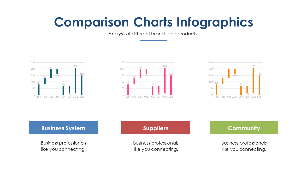
When you’re tasked with showcasing brand performance, clarity is key. This slide presents three distinct comparison charts, each designed to highlight different brands over a timeline. The visual appeal of these charts makes data analysis engaging and straightforward, ensuring your audience grasps the essential insights quickly. As a communications lead, you can use this slide to effectively summarize brand performance metrics for your team or stakeholders. For a content strategist, these charts provide a clear way to compare audience engagement across various campaigns, making it easier to identify which strategies resonate best. Marketing managers can leverage this slide to illustrate shifts in market trends, giving context to their analyses during strategy meetings. Each chart is customizable, allowing you to input your specific data effortlessly. $0.99 — add this single slide to any deck from the SlideSwift Slide Library. No subscription needed. Mix slides from any category to build your perfect deck.
Add more from this category to your custom deck