SlideSwift
By Category
💼Business 📊Infographics □Minimal 🕐Timelines ✨Neumorphic 🗑Diagrams 🔄Flow Charts ✨Glassmorphism 🎨Creative 🌍Abstract 🔄Cycle Diagrams 💎Isometric 🖼Illustrations 📱Social Media 🗺MapsBy Slide Type
🚀Pitch Deck 📌Roadmap 🔍SWOT Analysis 📅Timeline 📈Gantt Chart 🏢Org Chart 📋Funnel ⚖Comparison 📄Case Study 📋Agenda ⭐Icons & Lists 👏Thank You
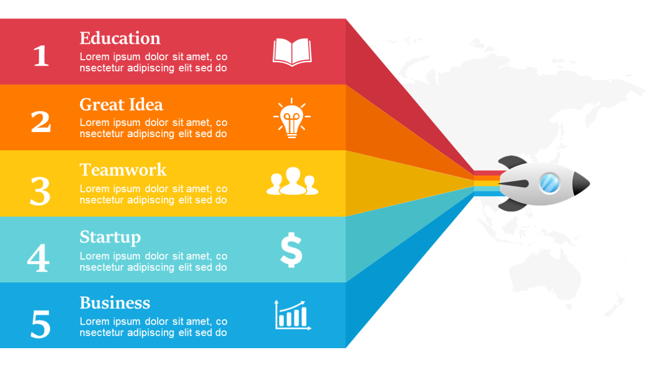
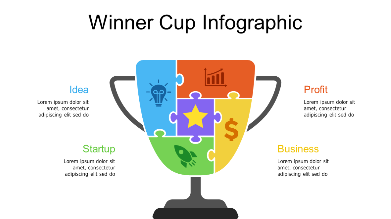
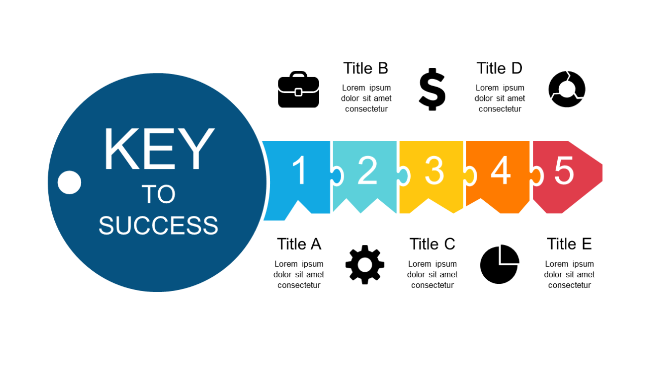
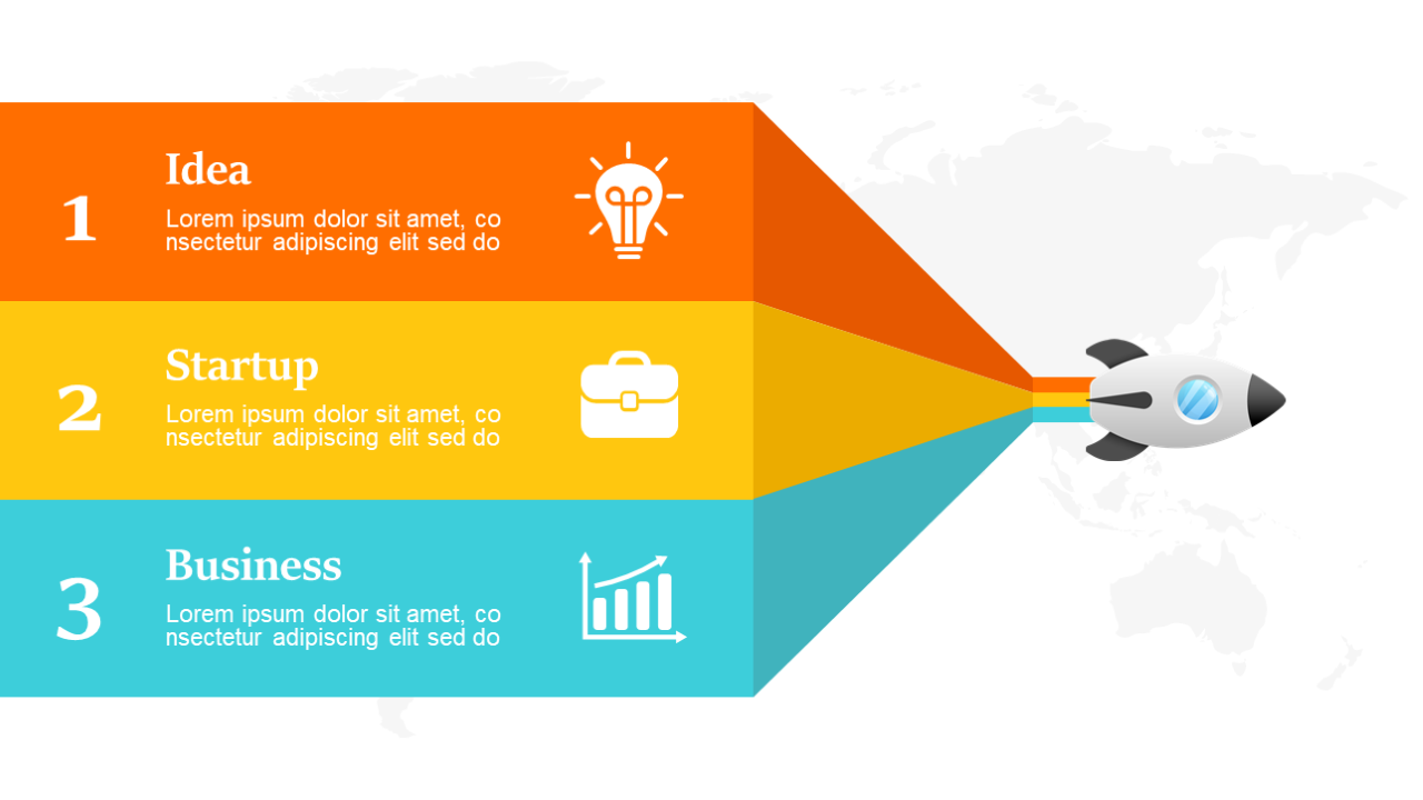
Understanding user behavior can be complex, especially when trying to convey insights to your team or stakeholders. This slide uses a clean, organized design to present comparative data effectively, allowing you to illustrate trends in user actions at a glance. With multiple sections to fill, it becomes a powerful tool for displaying information such as purchase patterns or engagement metrics. A content strategist can use this slide to present data-driven insights during a strategy meeting, ensuring clarity and focus in discussions. For a marketing manager, it serves as a way to showcase campaign performance comparisons, making it easier to identify which strategies resonate most with customers. A visual designer can leverage this slide to present user research findings, visually narrating the data story behind the numbers. Customization is straightforward; simply plug in your data and adjust the visuals to fit your narrative. $0.99 — add this single slide to any deck from the SlideSwift Slide Library. No subscription needed. Mix slides from any category to build your perfect deck.
Add more from this category to your custom deck