SlideSwift
By Category
💼Business 📊Infographics □Minimal 🕐Timelines ✨Neumorphic 🗑Diagrams 🔄Flow Charts ✨Glassmorphism 🎨Creative 🌍Abstract 🔄Cycle Diagrams 💎Isometric 🖼Illustrations 📱Social Media 🗺MapsBy Slide Type
🚀Pitch Deck 📌Roadmap 🔍SWOT Analysis 📅Timeline 📈Gantt Chart 🏢Org Chart 📋Funnel ⚖Comparison 📄Case Study 📋Agenda ⭐Icons & Lists 👏Thank You
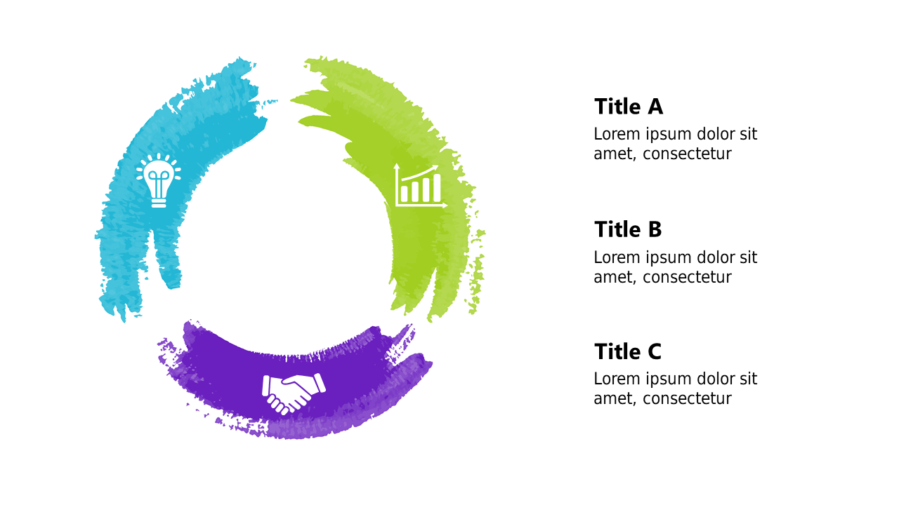
In today’s fast-paced world, capturing your audience’s attention with clear visuals is essential. If you find yourself struggling to present user engagement data effectively, this segmented circular chart is the perfect solution. It visually showcases various data distributions in an easy-to-understand format, making your statistics more digestible. The chart is split into three distinct segments, each customizable to represent different categories of user engagement, ensuring your message resonates with your audience. As a visual designer, you can easily integrate this slide into your presentations to highlight key insights. For communications leads, this chart can serve as a powerful tool to convey user engagement trends to stakeholders, making complex data accessible and engaging. Content strategists will appreciate how this slide can be used to illustrate the effectiveness of content campaigns across varied demographics. Customization is simple, allowing you to adjust colors and percentages to suit your branding. $0.99 — add this single slide to any deck from the SlideSwift Slide Library. No subscription needed. Mix slides from any category to build your perfect deck.
Add more from this category to your custom deck