SlideSwift
By Category
💼Business 📊Infographics □Minimal 🕐Timelines ✨Neumorphic 🗑Diagrams 🔄Flow Charts ✨Glassmorphism 🎨Creative 🌍Abstract 🔄Cycle Diagrams 💎Isometric 🖼Illustrations 📱Social Media 🗺MapsBy Slide Type
🚀Pitch Deck 📌Roadmap 🔍SWOT Analysis 📅Timeline 📈Gantt Chart 🏢Org Chart 📋Funnel ⚖Comparison 📄Case Study 📋Agenda ⭐Icons & Lists 👏Thank You
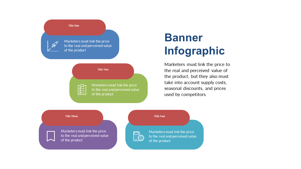
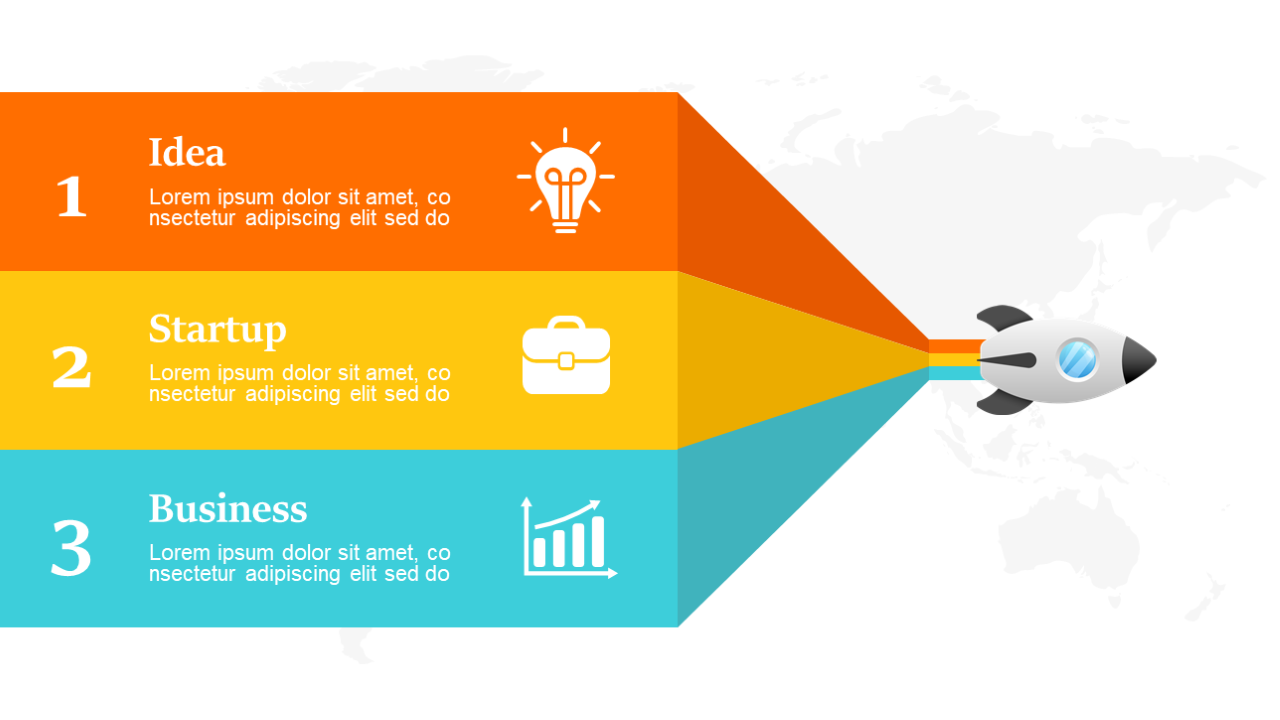
You know how difficult it can be to present key comparisons in an engaging way, especially when the details can get lost in a sea of text. This slide takes a fresh approach, using colorful boxes that are arranged in a clear, banner format, making your data pop visually and ensuring your audience can easily grasp the key points. With this design, you can showcase important statistics or product comparisons with clarity and style.
As a communications lead, this slide allows you to present data in a way that captivates your audience. If you’re a content strategist, you can effectively highlight the main features of your latest project at a glance. For marketing managers, this slide helps in illustrating product differences that could influence customer decisions.
Plus, customization is a breeze; you can edit the colors and text to match your branding and message seamlessly. $0.99 — add this single slide to any deck from the SlideSwift Slide Library. No subscription needed. Mix slides from any category to build your perfect deck.
Add more from this category to your custom deck